Ralph is a world-citizen, a geoinformation specialist by profession, and interested in many topics. Here, he'll confine himself mostly to things geo-visual.
In March, I have published a linked view display with a population cartogram of Switzerland (in German, in French). The occasion was a federal poll that convinced the majority of the voting population but didn’t gain support in enough many cantons. The cartogram has sparked quite some interest and I have covered its conceptualisation as … Continue reading Reworked versions of my hexagonal population cartogram
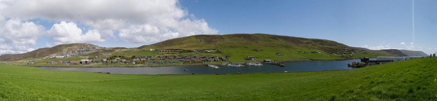
I can attest: Shetland (and presumably also Orkney) is a great place to visit. Not just for its landscapes, Shetland ponies and puffins, but also for its people, their language and – turns out – placenames!
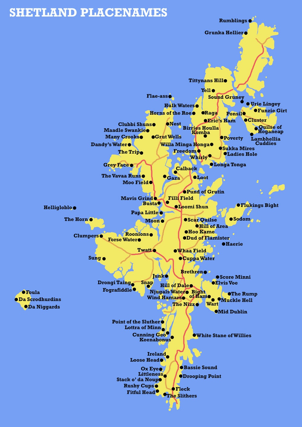
On Shetland, you can travel from Rumblings to Quilse of Hageneap, from Povertynot to riches but at least to Longa Tonga, from Willa Minga Honga via Pund of Grutin and Cuppa Water to Drooping Point. Turns out, Mid Dublin is on Shetland as well as something called Fografiddle! If you are a cunning geographer, you should at least once travel to Cunning Geo!
… is the title of my most recent project. It’s a bit artsy, but I think some of the concepts behind it may also have practical applications in this world of ever more abundant webcam footage (maybe need to think a bit more on this point later).
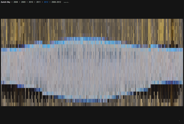
In Zurich Sky, I destilled yearly aggregates of the sky over Zurich Switzerland. I did this by first scraping tons of images from the website of the Swiss domain registrar SWITCH. They have two webcams, one in Zurich one in the Alps, whose images are publicly accessible in their archive (thanks!).
Zurich Sky: Web-scraped sky colour over Zurich, Switzerland
The SWITCH archive features one image every hour. Luckily for my project, the URLs of the individual pictures adhere to a nice structured format which makes automatic downloading of several thousand images rather easy. An example is here:
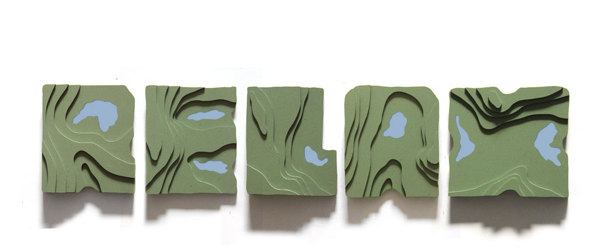
Neat idea by artist Siyu Cao: a typeface from topographic map excerpts. Hills, ridges and mountains signify letters’ bodies, lakes and low areas the empty spaces around and within letters. The typeface gains clarity when extruded to 3D: Made me wonder how a relief-shaded 2D version or a smoothly interpolated 3D version with imprinted contour … Continue reading Topography in typography
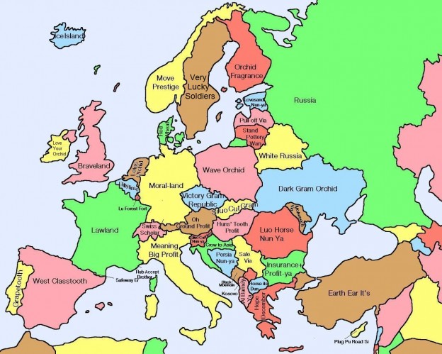
A while ago I proposed etymologic cartography as a field of study. Somewhat related, I found this map that doesn’t show the etymology of placenames but literal translations of country names into English from Chinese: Note: I have no way of checking the correctness of the place names in this map (and some do sound … Continue reading Chinese names of European countries
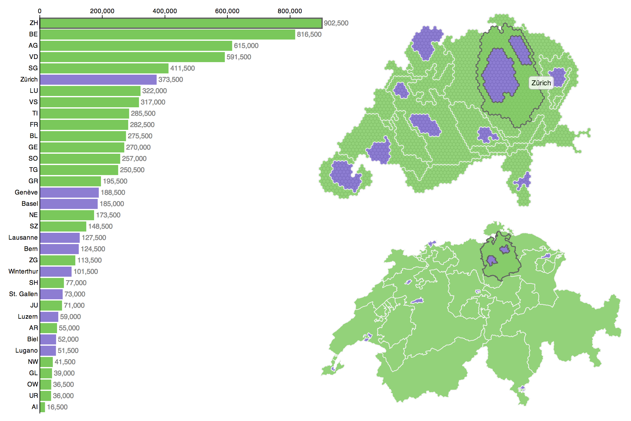
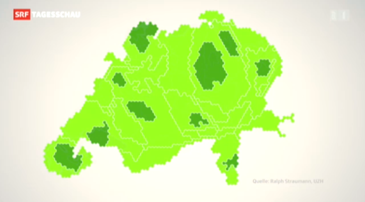
Some weeks ago I visualised the Swiss cantons (states) and their population numbers using what information visualization scientists call a linked view. You can click through to the actual, interactive visualization: here in German or here in French. In what follows I’ll describe the steps of data preparation for this visualization. I decided to keep the specifics on the implementation in D3.js for a third post in order to spare your scroll-wheel and -finger (so stay tuned for that one).
Intro
Welcome to the second part of this series in which I describe the production of this linked view with a population cartogram (top right):
In what follows, I’ll try to give you a thorough description of my approach at data processing. I’ll include some screenshots of intermediate results. Obviously, I don’t know how familiar you are with GISand spatial analysis terminology, so please bear with me if my description is too exhaustive. Conversely, speak up in the comments section, if I have forgotten something or something is not clear. I did all of the GIS analysis in Esri ArcGIS, however, any GIS that can handle vector data will do.
I started off with the following input data:
Outlines of administrative units (cantons and cities)
Spatially distributed population data from Swiss census
The preparation of the administrative units was quite straightforward: I applied a Union operation in GIS (ArcGIS Help Topic here). Then I did some tidying of the attributes and applied a set of geometric simplifications (polygon outline generalisations). The purpose of these is basically weeding out vertices from the geometries while preserving shape as well as possible. The bigger goal being, of course, simplifying the geometries enough for a fluid web experience down the line.
Swiss census data comes as a point grid at 100 meters resolution. Precise data characteristics don’t matter too much. And one could also use a thematic variable that comes at the same resolution as the display units – cantons and cities in this case. While the handling of canton/city level thematic data would be much easier, the spatially distributed thematic variable in this case allows for a more representative cartogram. If you wonder why, consider, for example, a US setting: Salt Lake City would cause a big local distortion in a cartogram using spatially distributed data, whereas its population would be spread out uniformly throughout all of Utah, if you use state-level data. This effect causes visible differences in the cartogram in regions where population distribution is not spatially uniform.
The GIS processing chain starts with these steps:
Generation of a grid (in my case at 5 km resolution, but that number is a bit dependent on the resolution of your input data, your area of interest and maybe your application; as a rule of thumb, I’d suggest a grid resolution that is similar to the size of your hexagons). Any regular tesselation other than a rectangular grid will also do.
Union operation on the grid cells and the administrative units. This yields smaller spatial analysis units, that follow the boundaries between administrative units.
Spatial join of thematic variable to the new spatial units. A spatial join is a GIS operation where the spatial relationship of entities in two different datasets is evaluated. If a specified relationship is fulfilled, the characteristics of the features in the join dataset are joined to the features in the target dataset. The spatial relationship for this operation was containment (i.e. the criterion was: is a given census data point within the spatial unit at hand?). The join operation encompassed summing up the values. The overall process yields the sum of the population at all census data points which fall within a given spatial analysis unit – or, without the GIS lingo: the total population per unit).
For distortions you need a Scape… toad
The resulting data in Shapefile format was then transferred to the cartogram software Scapetoad. Scapetoad is a freely available Java software developed in the Choros Laboratory at EPFL in Lausanne. It employs the diffusion-based cartogram algorithm by Gastner–Newman. I did several model runs and iteratively tuned the algorithm parameters. That encompassed mainly striking an acceptable balance between subjective quality of the result and cartogram computation time. Unfortunately, I cannot give heuristics for this, you’ll really simply have to try with your data.
When I was happy with the result, I re-imported the cartogram dataset from Scapetoad into the GIS and used a Dissolve operation to aggregate the units back into regions (again, any GIS will do, but the precise name for the operation may vary).
Cartogram production part 1: (1) Preparation of cantons and cities dataset (2) Union of dataset with grid (3) Import into Scapetoad and distorting (4) Re-import into GIS and dissolving the geometries
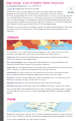
The Ordnance Survey blog posted a nice small compilation of cartographic resources today. They add some more colour resources over the ones I have already reviewed, as well as sites on fonts, symbols and “inspiration” (can’t all of us use some of the latter from time to time? ;-). Definitely not all of the listed … Continue reading OS map design resources
Some weeks ago I visualised the Swiss cantons (states) and their population numbers using what information visualization scientists call a linked view. You can click through to the actual, interactive visualization: here in German or here in French. In what follows I want to give a bit more detail about what led to this visualization and what conceptual thinking went into the design.
In a subsequent post I will also describe the toolset I used to produce this visualization, so that you can build your own. If you’re not interested in the Background, you can skip to the Conceptually section. If that’s neither your cup of tea and you’re here primarily because you want to know how to produce such a visualization yourself, you’ll unfortunately have to patience yourself and wait for the second part of this series (it’s here!).
Background
Why population sizes matter – in such a small country
Why is the particular piece of information that is visualised here important or interesting? Well, in the Swiss political system cantons are represented at the federal level, whereas cities aren’t. However, some of the big cities represent a considerably larger number of people than quite some of the smaller cantons. There have been many debates if and how cities ought to be represented in the political system, about the specificity of urban issues and how those are dealt with or ignored in Swiss politics and if weighting of the cantons should be adapted to better match their population size. The issue crops up both in relation to elections and polls (Switzerland having a direct democracy there are really many of the latter).
Cartogram on Swiss TV
When I published the visualization Switzerland has just held such a poll. The poll did not pass, it achieved only 54.3% of “yes” votes.
– Wait, what? Yep, the vote won a solid majority of the people, but too many cantons said “nay” and thus, by the rules, it was a “nay”. Now, one can argue that this is not sensible or that it is perfectly sensible, I’m not going to do this here. But this background means, to my pleasure, that the visualisation was able to spark and inform many discussions (and met quite an audience). To my big surprise, it was even briefly featured in nation-wide primetime news, in a slightly reworked version. Continue reading “Conceptualisation of a D3 linked view with a hexagonal cartogram”
Picking up where I have left, I have a nice addition to my collection of colour tools for visualisation experts: http://color.hailpixel.com What you see below is the whole interface, when you open the website by Devin Hunt. Choosing colours is easy as pie: Move your mouse pointer around and the area changes its colour. Once you … Continue reading Hailpixel’s colour tool
When designing a map or a visualisation, sooner or later there is the point where you have to choose a range of colours (except in very specific circumstances which may require you to produce a black-and-white or greyscale visualisation). What is there to consider in such a situation?
Appropriate use of colours
According to Bertin‘s (1918–2010) seminal work, Semiologie Graphique, colour (defined as hue with constant value) as a visual variable is both selective and associative. These mean, respectively, that an object with slightly differing hue can be selected with ease out of a group of objects and that objects with identical colour but differing values for other visual variables (e.g., in the case of shape as the other variable: a red circle, a red square and a red triangle) can easily be grouped mentally. Continue reading “Colour me well-informed”
Digital Photography School has a nice gallery of kite aerial photography (or KAP, as it’s called amongst insiders): I have to date built various kites myself and actually also one of the KAP rigs shown in the gallery and have done some KAP experiments myself. KAP is lightweight, can produce affordable aerial photography and is … Continue reading Kite aerial photography gallery
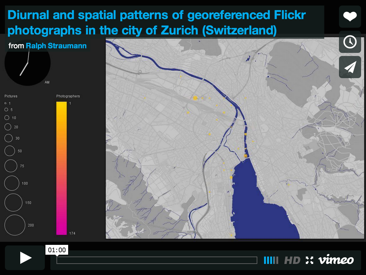
After my project proposal had been accepted, I have attended a workshop at ETH Zurich, titled “Cartography & Narratives” organised by Barbara Piatte, Sébastien Caquard and Anne-Kathrin Reuschel in last summer. The goal of the workshop was to explore “mapping as a conceptual framework to improve our understating of narratives”. Narratives are “an expression in discourse of … Continue reading Flickr as a vehicle of narrative: photos contextualised in space and time


 (as can be seen from