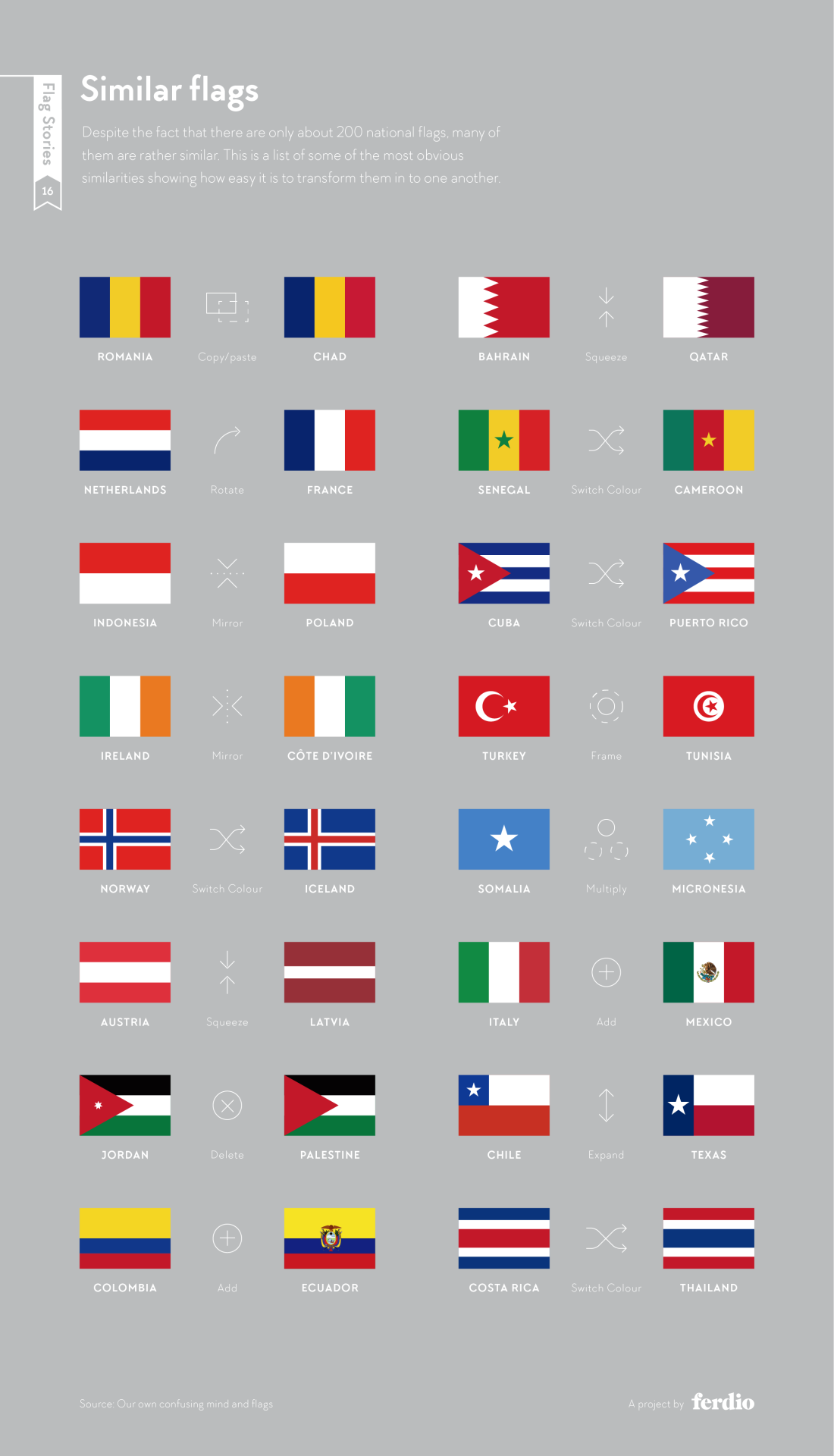
Alas, New Zealand’s proposition for a new flag design has been voted against a few weeks ago: But flags are always an interesting topic of discussion, from a design, cultural, historic, or simply aesthetic point of view. Via my friend Frank Ostermann I’ve learnt about Flag Stories, a website dedicated to the design elements (patterns, … Continue reading Flag geekery
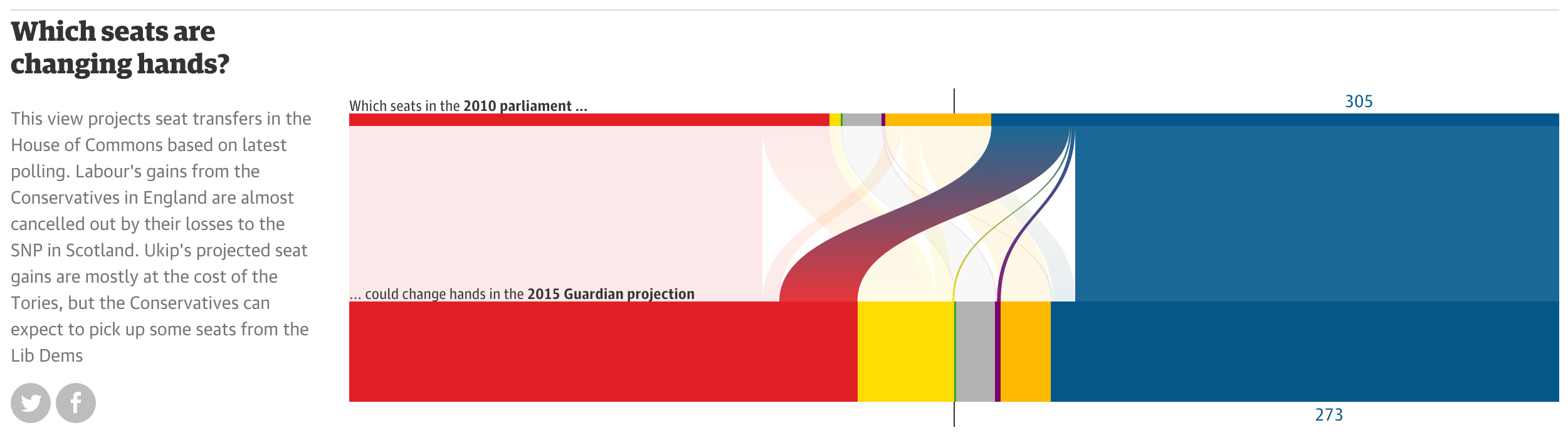
A few weeks ago, I came across the following graphics on Twitter: They depict voter share per party (including absentees, in grey) (top) and voter flows between different parties in the 2015 cantonal elections in Zurich. The graphics are produced by sotomo, a research company at the nexus of science and practical application occupying itself with political and … Continue reading Visualizing group sizes and inter-group flows
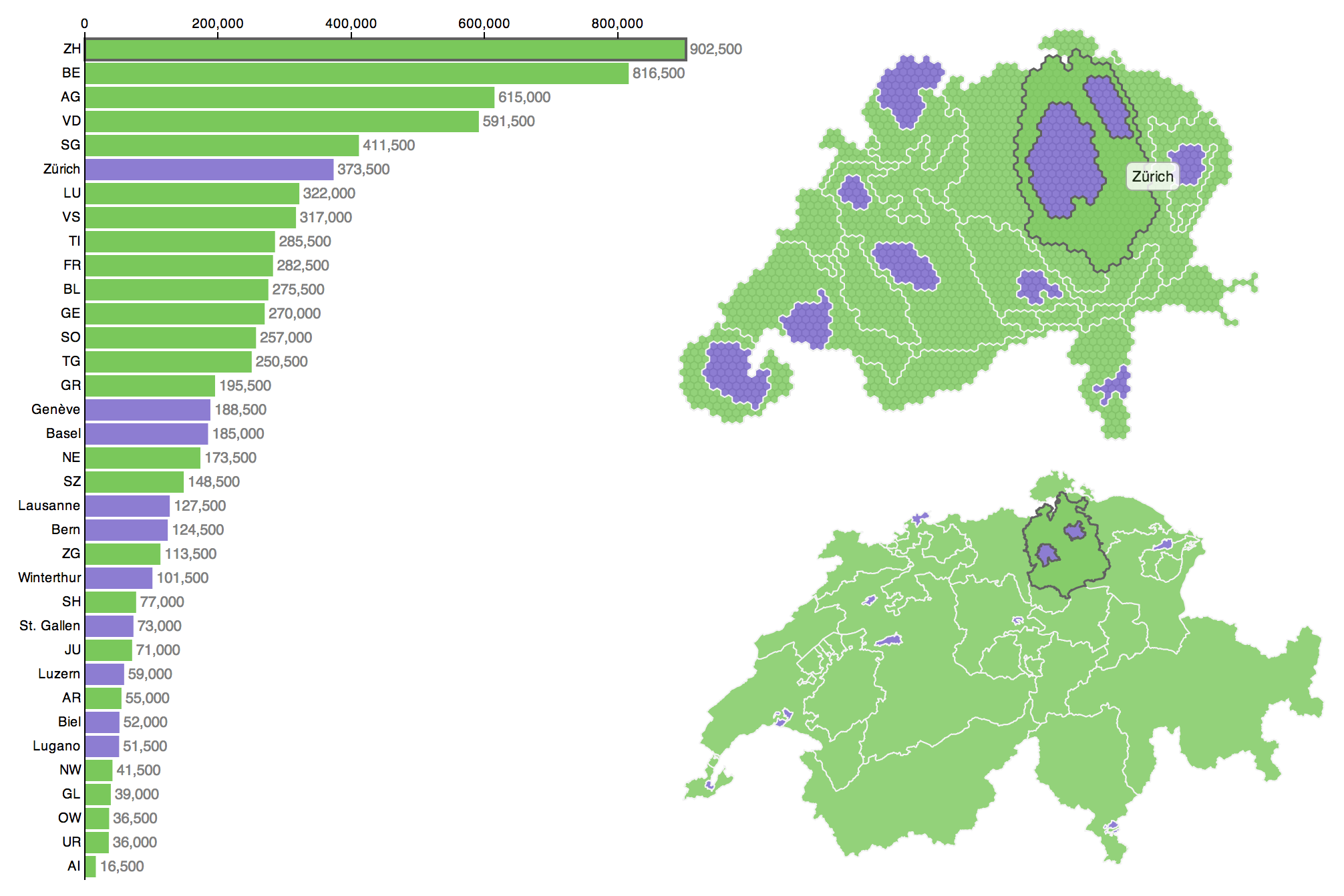
Some weeks ago I visualised the Swiss cantons (states) and their population numbers using what information visualization scientists call a linked view. You can click through to the actual, interactive visualization: here in German or here in French. In what follows I’ll describe the steps of data preparation for this visualization. I decided to keep the specifics on the implementation in D3.js for a third post in order to spare your scroll-wheel and -finger (so stay tuned for that one).
Intro
Welcome to the second part of this series in which I describe the production of this linked view with a population cartogram (top right):
In what follows, I’ll try to give you a thorough description of my approach at data processing. I’ll include some screenshots of intermediate results. Obviously, I don’t know how familiar you are with GISand spatial analysis terminology, so please bear with me if my description is too exhaustive. Conversely, speak up in the comments section, if I have forgotten something or something is not clear. I did all of the GIS analysis in Esri ArcGIS, however, any GIS that can handle vector data will do.
I started off with the following input data:
Outlines of administrative units (cantons and cities)
Spatially distributed population data from Swiss census
The preparation of the administrative units was quite straightforward: I applied a Union operation in GIS (ArcGIS Help Topic here). Then I did some tidying of the attributes and applied a set of geometric simplifications (polygon outline generalisations). The purpose of these is basically weeding out vertices from the geometries while preserving shape as well as possible. The bigger goal being, of course, simplifying the geometries enough for a fluid web experience down the line.
Swiss census data comes as a point grid at 100 meters resolution. Precise data characteristics don’t matter too much. And one could also use a thematic variable that comes at the same resolution as the display units – cantons and cities in this case. While the handling of canton/city level thematic data would be much easier, the spatially distributed thematic variable in this case allows for a more representative cartogram. If you wonder why, consider, for example, a US setting: Salt Lake City would cause a big local distortion in a cartogram using spatially distributed data, whereas its population would be spread out uniformly throughout all of Utah, if you use state-level data. This effect causes visible differences in the cartogram in regions where population distribution is not spatially uniform.
The GIS processing chain starts with these steps:
Generation of a grid (in my case at 5 km resolution, but that number is a bit dependent on the resolution of your input data, your area of interest and maybe your application; as a rule of thumb, I’d suggest a grid resolution that is similar to the size of your hexagons). Any regular tesselation other than a rectangular grid will also do.
Union operation on the grid cells and the administrative units. This yields smaller spatial analysis units, that follow the boundaries between administrative units.
Spatial join of thematic variable to the new spatial units. A spatial join is a GIS operation where the spatial relationship of entities in two different datasets is evaluated. If a specified relationship is fulfilled, the characteristics of the features in the join dataset are joined to the features in the target dataset. The spatial relationship for this operation was containment (i.e. the criterion was: is a given census data point within the spatial unit at hand?). The join operation encompassed summing up the values. The overall process yields the sum of the population at all census data points which fall within a given spatial analysis unit – or, without the GIS lingo: the total population per unit).
For distortions you need a Scape… toad
The resulting data in Shapefile format was then transferred to the cartogram software Scapetoad. Scapetoad is a freely available Java software developed in the Choros Laboratory at EPFL in Lausanne. It employs the diffusion-based cartogram algorithm by Gastner–Newman. I did several model runs and iteratively tuned the algorithm parameters. That encompassed mainly striking an acceptable balance between subjective quality of the result and cartogram computation time. Unfortunately, I cannot give heuristics for this, you’ll really simply have to try with your data.
When I was happy with the result, I re-imported the cartogram dataset from Scapetoad into the GIS and used a Dissolve operation to aggregate the units back into regions (again, any GIS will do, but the precise name for the operation may vary).
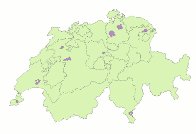
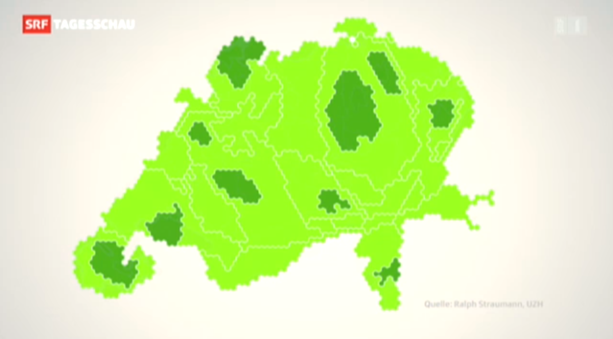
Cartogram production part 1: (1) Preparation of cantons and cities dataset (2) Union of dataset with grid (3) Import into Scapetoad and distorting (4) Re-import into GIS and dissolving the geometries
Some weeks ago I visualised the Swiss cantons (states) and their population numbers using what information visualization scientists call a linked view. You can click through to the actual, interactive visualization: here in German or here in French. In what follows I want to give a bit more detail about what led to this visualization and what conceptual thinking went into the design.
In a subsequent post I will also describe the toolset I used to produce this visualization, so that you can build your own. If you’re not interested in the Background, you can skip to the Conceptually section. If that’s neither your cup of tea and you’re here primarily because you want to know how to produce such a visualization yourself, you’ll unfortunately have to patience yourself and wait for the second part of this series (it’s here!).
Background
Why population sizes matter – in such a small country
Why is the particular piece of information that is visualised here important or interesting? Well, in the Swiss political system cantons are represented at the federal level, whereas cities aren’t. However, some of the big cities represent a considerably larger number of people than quite some of the smaller cantons. There have been many debates if and how cities ought to be represented in the political system, about the specificity of urban issues and how those are dealt with or ignored in Swiss politics and if weighting of the cantons should be adapted to better match their population size. The issue crops up both in relation to elections and polls (Switzerland having a direct democracy there are really many of the latter).
Cartogram on Swiss TV
When I published the visualization Switzerland has just held such a poll. The poll did not pass, it achieved only 54.3% of “yes” votes.
– Wait, what? Yep, the vote won a solid majority of the people, but too many cantons said “nay” and thus, by the rules, it was a “nay”. Now, one can argue that this is not sensible or that it is perfectly sensible, I’m not going to do this here. But this background means, to my pleasure, that the visualisation was able to spark and inform many discussions (and met quite an audience). To my big surprise, it was even briefly featured in nation-wide primetime news, in a slightly reworked version. Continue reading “Conceptualisation of a D3 linked view with a hexagonal cartogram”
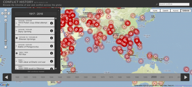
The Dutch web development Studio TecToys built http://www.conflicthistory.com, a map and timeline of all important human conflicts. The base data for the visualization comes from Freebase and is enriched with Wikipedia content. The timeline lets you slice the data at adjustable interval widths. I’m not sure, just how exhaustive and geographically un-biased the coverage of the data … Continue reading Sad map: Conflicts of humankind
I’ve recently been playing with D3.js, mainly for my side-project, SoMePolis, which investigates social media usage by Swiss MPs. D3.js (D3: data-driven documents) is a Javascript library for creating complex, static or animated/interactive web graphics using HTML, SVG and CSS. The main site has a short tutorial and lots of example implementations. A well-known solid introduction to … Continue reading Visualizing Swiss politicians on Twitter using D3.js
I’ve highlighted the NY Times’ Opinionator blog before. Back then, Franc Jacobs wrote a piece about the delimitation of the rather fuzzy geographic entity called “Europe”.
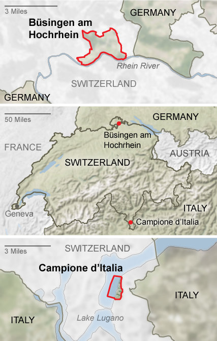
Today, there’s a new blog post about Enclave Hunting in Switzerland. After the mandatory clichées (the relevance of the “National Yodeling Festival” can probably be gleaned from the fact that it takes place only “once every three years”… – as opposed to, say, the Montreux Jazz Festival), the piece gets more interesting when it explores the many national (intercantonal) and in fact two international enclaves of Switzerland. The curious topology of the two Appenzells and Sankt Gallen are dealt with as well as the enclaves of e.g. Fribourg and Geneva.
The two international enclaves of Switzerland: Büsingen and Campione (Source: NY Times)
I acknowledge, it’s been rather quiet in these regions of the web. Why, you ask? I have been rather busy with a sort-of spinoff project I pursue with two friends. After having published about the Twitter network of journalists here, here and here, I directed my interest towards politicians. With two friends, Tom Wider and … Continue reading Where was I?
Via the GIS Doctor (in itself a fun blog) I got introduced to NY Times’ Opinionator. The Borderlines category on the Opinionator is maintained by author/blogger Franc Jacobs who “writes about cartography, but only the interesting bits.” Borderlines writes about interesting stories around country borders. So far, I’ve read the superbly entertaining and well informed … Continue reading Where’s Europe?
As recent discussions show, open data is a huge topic also in the geoinformation sphere. I think the political importance of this movement cannot be stressed enough. Opendata.ch invites tomorrow [German/French], January 19, to its founding event in Bern, Switzerland. I’ll be there! Let me know, if you’d like to join. Continue reading Opendata.ch founding event
Celebrating the publication of a revised Death & Taxes poster (a visualization of the allocation of the U.S. budget) Seth Godin has a few words about the power of visualization: Data is not useful until it becomes information, and that’s because data is hard for human beings to digest. It is not possible to spend … Continue reading Seth Godin on the power of visualization