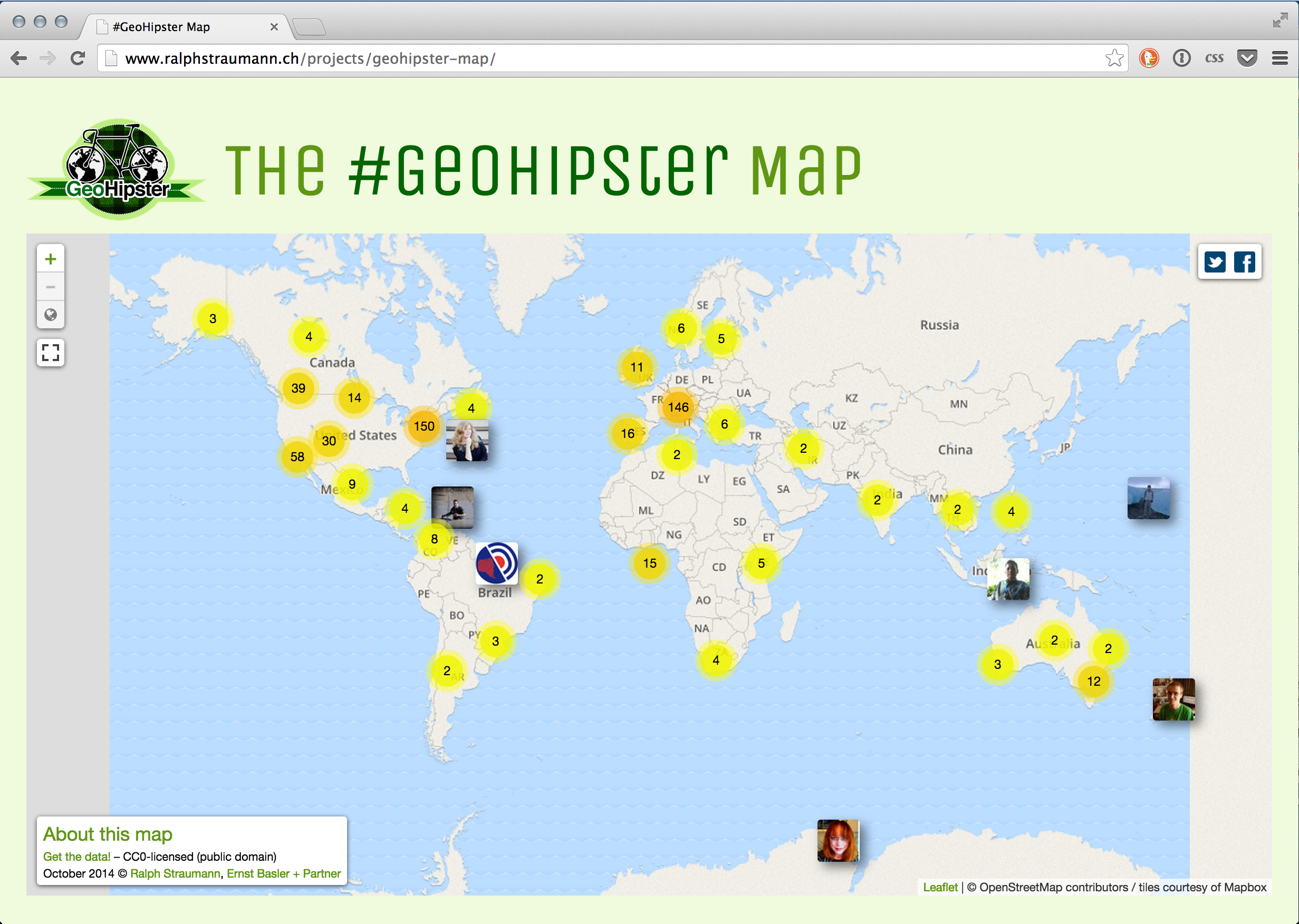
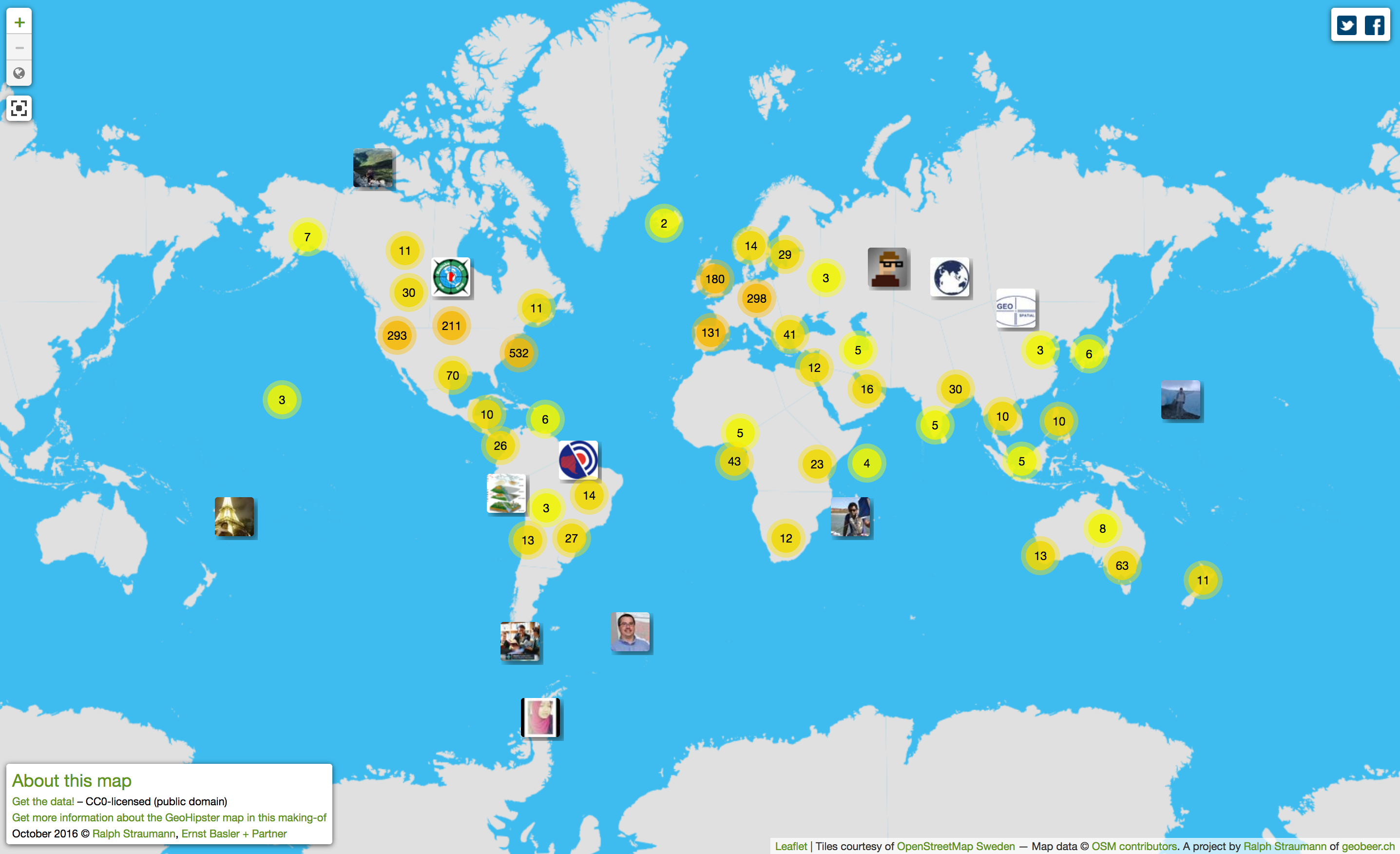
To all you Geohipsters out there

Have you heard of the Geohipster blog? It’s the self-described place for people who ‘grow their own organic vertices, use gluten-free topology or only geocode by hand, in small batches’. And I give at a big recommendation, put it into your feed reader. And relax, you don’t need to be a fixie aficionado/-a in order to appreciate the Geohipster movement. Atanas … Continue reading To all you Geohipsters out there

Geocoding Twitter users – The #SwissGIS map

Recently, I’ve been experimenting with some Twitter-oriented hacks together with my friend Tom. A very preliminary result of these activities is what I call the #SwissGIS map. Some, just a little, history: Over the last few years, I have been collecting Switzerland-based Twitter users that talk about topics around GIS, cartography, webmapping and geomatics on a list called SwissGIS. Find … Continue reading Geocoding Twitter users – The #SwissGIS map

On the Beyoncé tweet map

Kenneth Field, Senior Cartographic Product Engineer with Esri and controversial blogger (to some, at least), felt compelled to write a critique of Simon Rogers‘ Beyoncé twitter map (on occasion of an album release) that was hyped by Time Magazine (in a punny way) as being “flawless” (to be very clear: the “flawless” attribute does not originate from the map author and … Continue reading On the Beyoncé tweet map

Eric Fischer: Mapmaker, artist and programmer

The Atlantic Cities has a nice portrait of Eric Fischer: Mapmaker, artist, or programmer?. If you have been following information visualization and geovisualization news online over the recent years, I bet you have come across Fischer’s work. A few examples: “Ultimately, almost everything I have been making tries to take the dim, distant glimpse of … Continue reading Eric Fischer: Mapmaker, artist and programmer

Visualizing Swiss politicians on Twitter using D3.js

I’ve recently been playing with D3.js, mainly for my side-project, SoMePolis, which investigates social media usage by Swiss MPs. D3.js (D3: data-driven documents) is a Javascript library for creating complex, static or animated/interactive web graphics using HTML, SVG and CSS. The main site has a short tutorial and lots of example implementations. A well-known solid introduction to … Continue reading Visualizing Swiss politicians on Twitter using D3.js

Where was I?

I acknowledge, it’s been rather quiet in these regions of the web. Why, you ask? I have been rather busy with a sort-of spinoff project I pursue with two friends. After having published about the Twitter network of journalists here, here and here, I directed my interest towards politicians. With two friends, Tom Wider and … Continue reading Where was I?

Journalists’ Twitter network

[Deutsch weiter unten] Recently, I’ve been looking into analysis and visualization of Twitter networks. So, David Bauer posting a list of 300+ German-speaking, Twitter-using journalists came just right. Scroll down to see the resulting network. By they way, you can find more information on the technical background of the production of these Twitter network visualizations in this post. [German] … Continue reading Journalists’ Twitter network

Twitter networks – Mechanics

[Deutsch weiter unten] Recently, I’ve been working on a Twitter-related project with two friends of mine. As there’s nothing to present yet, I won’t go into detail regarding that project. But working on Twitter-related stuff led me to explore the generation, modelling, analysis and visualization of Twitter networks. Then, some weeks back, Swiss journalist/author/blogger David … Continue reading Twitter networks – Mechanics

Economist’s Africa Twitter map provides some teachable insights

Mark Graham has posted a critique of a “Twitter map” that featured in the Economist at Zerogeography. The map was compiled by Portland Communications and Tweetminster and shows the number of tweets per country (original version of the map can be found in this presentation by Portland Communications): Mark Graham raises these interesting points regarding … Continue reading Economist’s Africa Twitter map provides some teachable insights