A few weeks ago, I came across the following graphics on Twitter: They depict voter share per party (including absentees, in grey) (top) and voter flows between different parties in the 2015 cantonal elections in Zurich. The graphics are produced by sotomo, a research company at the nexus of science and practical application occupying itself with political and … Continue reading Visualizing group sizes and inter-group flows
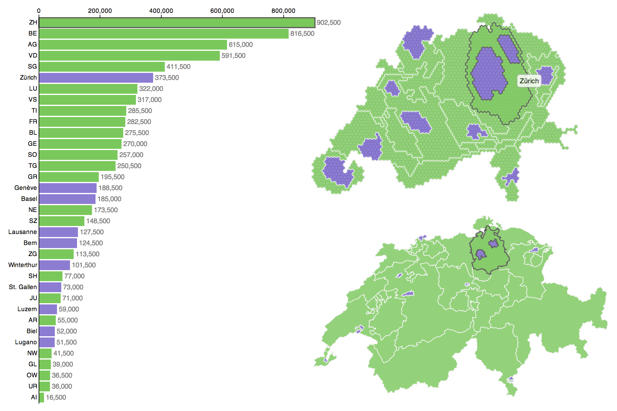
Some weeks ago I visualised the Swiss cantons (states) and their population numbers using what information visualization scientists call a linked view. You can click through to the actual, interactive visualization: here in German or here in French. In what follows I want to give a bit more detail about what led to this visualization and what conceptual thinking went into the design.
In a subsequent post I will also describe the toolset I used to produce this visualization, so that you can build your own. If you’re not interested in the Background, you can skip to the Conceptually section. If that’s neither your cup of tea and you’re here primarily because you want to know how to produce such a visualization yourself, you’ll unfortunately have to patience yourself and wait for the second part of this series (it’s here!).
Background
Why population sizes matter – in such a small country
Why is the particular piece of information that is visualised here important or interesting? Well, in the Swiss political system cantons are represented at the federal level, whereas cities aren’t. However, some of the big cities represent a considerably larger number of people than quite some of the smaller cantons. There have been many debates if and how cities ought to be represented in the political system, about the specificity of urban issues and how those are dealt with or ignored in Swiss politics and if weighting of the cantons should be adapted to better match their population size. The issue crops up both in relation to elections and polls (Switzerland having a direct democracy there are really many of the latter).
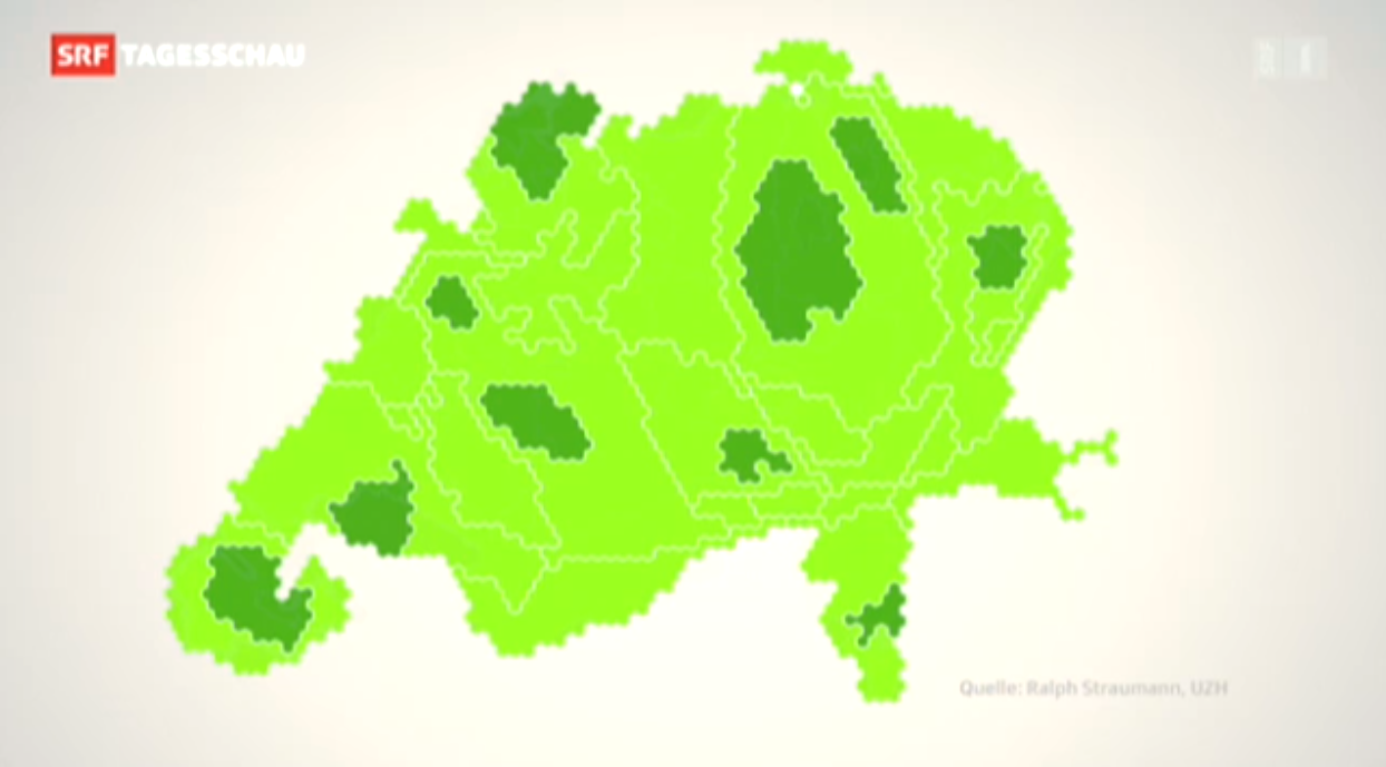
Cartogram on Swiss TV
When I published the visualization Switzerland has just held such a poll. The poll did not pass, it achieved only 54.3% of “yes” votes.
– Wait, what? Yep, the vote won a solid majority of the people, but too many cantons said “nay” and thus, by the rules, it was a “nay”. Now, one can argue that this is not sensible or that it is perfectly sensible, I’m not going to do this here. But this background means, to my pleasure, that the visualisation was able to spark and inform many discussions (and met quite an audience). To my big surprise, it was even briefly featured in nation-wide primetime news, in a slightly reworked version. Continue reading “Conceptualisation of a D3 linked view with a hexagonal cartogram”
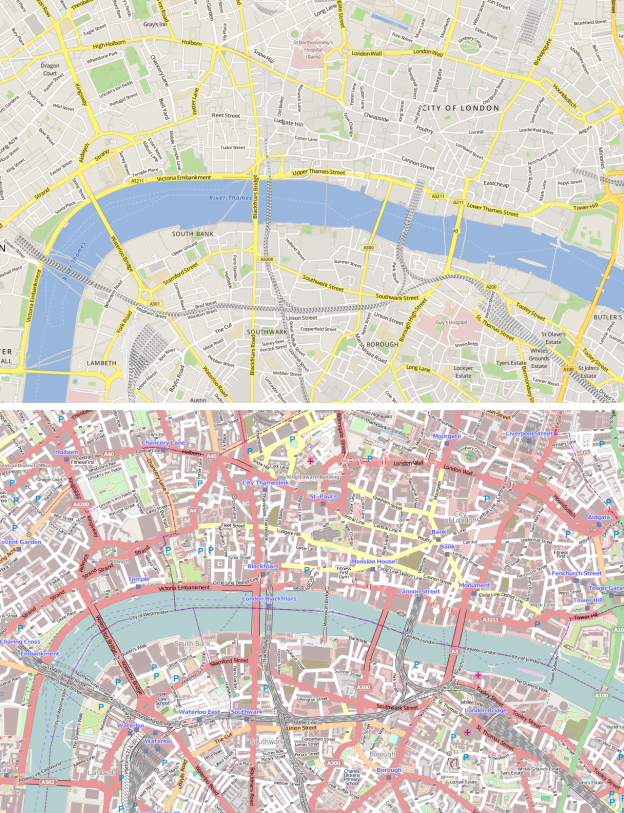
Skobbler produces apps and maps based on OpenStreetMap (OSM) data. Under http://maps.skobbler.com they’ve released an OSM-based map. I’ve always had mixed feelings about how OSM presented their map online. While I like the project very much and on and off use OSM data in my projects, I don’t like many things about the visual style both of … Continue reading Skobbler’s OSM map
This: made me chuckle. There is indeed a plethora of badly designed infographics out there (often these bad specimens are images 300 px wide and 3000 px high). Honestly, I have my doubts about this format anyway: e.g. I think infographics often don’t give enough context to the statistics they depict to do a topic … Continue reading On poorly designed infographics
I remember my early days of computing: There has been a lot of command line stuff going on (and QBASIC programming). Then came Windows 3.1 et al. on our home computer and Macs at school. Later, at university with Unix there has been more command line action again. Nevertheless, computing has clearly become more graphical … Continue reading The sketchbook holding the GUI design of early Macs
A while ago I blogged about The Real Underground, a website which allows visitors to morph the current London Underground Map into the famous 1931/1933 design by Harry Beck and into a geographically accurate depiction of the Underground network. Now, The Economist presents a reworked version of the Harry Beck design by London-based Designer Mark … Continue reading A new take on London’s underground
Yay, my hope’s coming true, apparently the new visual style of Google+ is contagious within the Google realm. Both GMail and Google Calendar will feature de-cluttered GUIs. In Gmail they are already accessible as themes (called Preview and Preview (dense)), GCal will follow soon. (via Engadget and GMail Blog) Continue reading New visual styles in Google products
Thenetisabuzz with the news about Google+, Google’s newest attempt to counter Facebook’s dominance in the realm of social networks. Besides India and Brasil, where Google’s Orkut seems popular, the search engine giant has so far failed to successfully enter the social network ground.
"On one hand, you'll never be able to convince your parents to switch. On the other hand, you'll never be able to convince your parents to switch!" (by xkcd)


")