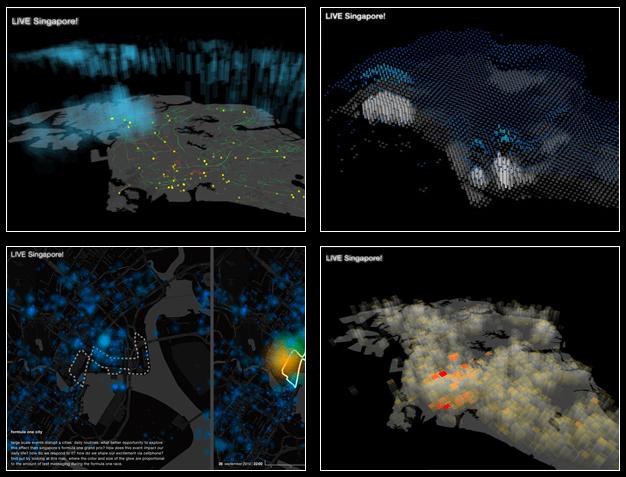
 In cooperation with local partners MIT’s Senseable City Lab has developed six real-time visualizations of the city of Singapore which is on display since April 8 in the exhibition LIVE Singapore!, co-curated with the Singapore Art Museum.
LIVE Singapore! closes the feedback loop between people moving in the city and the digital real-time data collected in multiple networks. It gives the data back to the people who themselves generate it through their actions, allowing them to be more in sync with their environment as well as to taking decisions on the basis of information that reflect the actual state of their city.
All six featured visualizations are spatial. Hub of the world (depicted above) displays the flows to and from the city’s airport and seaport. Isochronic Singapore is an isochronic map, where the geography of Singapore is deformed proportionally to the travel time between locations, updated continuously to reflect different traffic regimes on different days in the week. Raining taxis overlays taxi and rainfall data to investigate the interactions of these phenomena. Urban energy overlays excess outdoors temperature caused by A/C and power consumption, identifying (power-hungry) heat islands within the city. Formula One city displays the short message activity taking place during the Singapore Formula 1 race. Finally, Real-time talk displays cellphone network usage in the city with 140% (> 1 phone per person!) cellphone coverage.

The geovisualizations look exciting. In an accompanying text detailling a bit of the research that is behind these visualizations, the authors state that
[t]wo dimensional layered views have long been the most common way of representing and interacting with geo-referenced datasets. Developing LIVE Singapore! (…) new models are being explored to gain access to (…) time and location based data streams. As Singapore is a vertical city, we explore how to structure real-time data streams using 3 dimensional models and how to visually access this information efficiently.
I would be interested to learn more about the potential of such 3D visualizations compared to the “two dimensional layered views” (a.k.a. GIS-based maps). Unfortunately, the full potential of the visualizations cannot be gleaned from the website, since on the Press page all of them are displayed only as static screenshots and relatively small. Out of the six, only Raining taxis, Urban energy and Real-time talk seem to be 3D depictions. While I think the display works well for the latter two, in case of Raining taxis I find it hard to judge the relation between the fuzzy ‘rain cubes’ and the taxi information – but that is probably just the unfortunate angle of the static image, in reality the perspective of the visualizations can be modified (Raining taxis is the only one which shows instructions on how to do that – not sure if it is the only one to include the functionality).
It’s a shame I won’t be in Singapore anytime soon.
(via Flowing Data)