This:
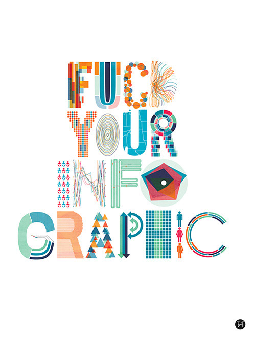
made me chuckle.
There is indeed a plethora of badly designed infographics out there (often these bad specimens are images 300 px wide and 3000 px high). Honestly, I have my doubts about this format anyway: e.g. I think infographics often don’t give enough context to the statistics they depict to do a topic justice. Rather they go for spectacular numbers. When these come along in a too isolated manner, they may still manage to impress, but they lose their informative value. To make things worse, infographics are sometimes created as link bait in an SEO strategy.
I wonder: Is there or will there ever be an infographic about the rise and demise of infographics on the web? – Infographics in an eternal loop.
Brain. Hurts. Must. Stop. Now.
(via Yes Machine)
3 thoughts on “On poorly designed infographics”
Comments are closed.