Some weeks ago I visualised the Swiss cantons (states) and their population numbers using what information visualization scientists call a linked view. You can click through to the actual, interactive visualization: here in German or here in French. In what follows I want to give a bit more detail about what led to this visualization and what conceptual thinking went into the design.
In a subsequent post I will also describe the toolset I used to produce this visualization, so that you can build your own. If you’re not interested in the Background, you can skip to the Conceptually section. If that’s neither your cup of tea and you’re here primarily because you want to know how to produce such a visualization yourself, you’ll unfortunately have to patience yourself and wait for the second part of this series (it’s here!).
Background
Why population sizes matter – in such a small country
Why is the particular piece of information that is visualised here important or interesting? Well, in the Swiss political system cantons are represented at the federal level, whereas cities aren’t. However, some of the big cities represent a considerably larger number of people than quite some of the smaller cantons. There have been many debates if and how cities ought to be represented in the political system, about the specificity of urban issues and how those are dealt with or ignored in Swiss politics and if weighting of the cantons should be adapted to better match their population size. The issue crops up both in relation to elections and polls (Switzerland having a direct democracy there are really many of the latter).
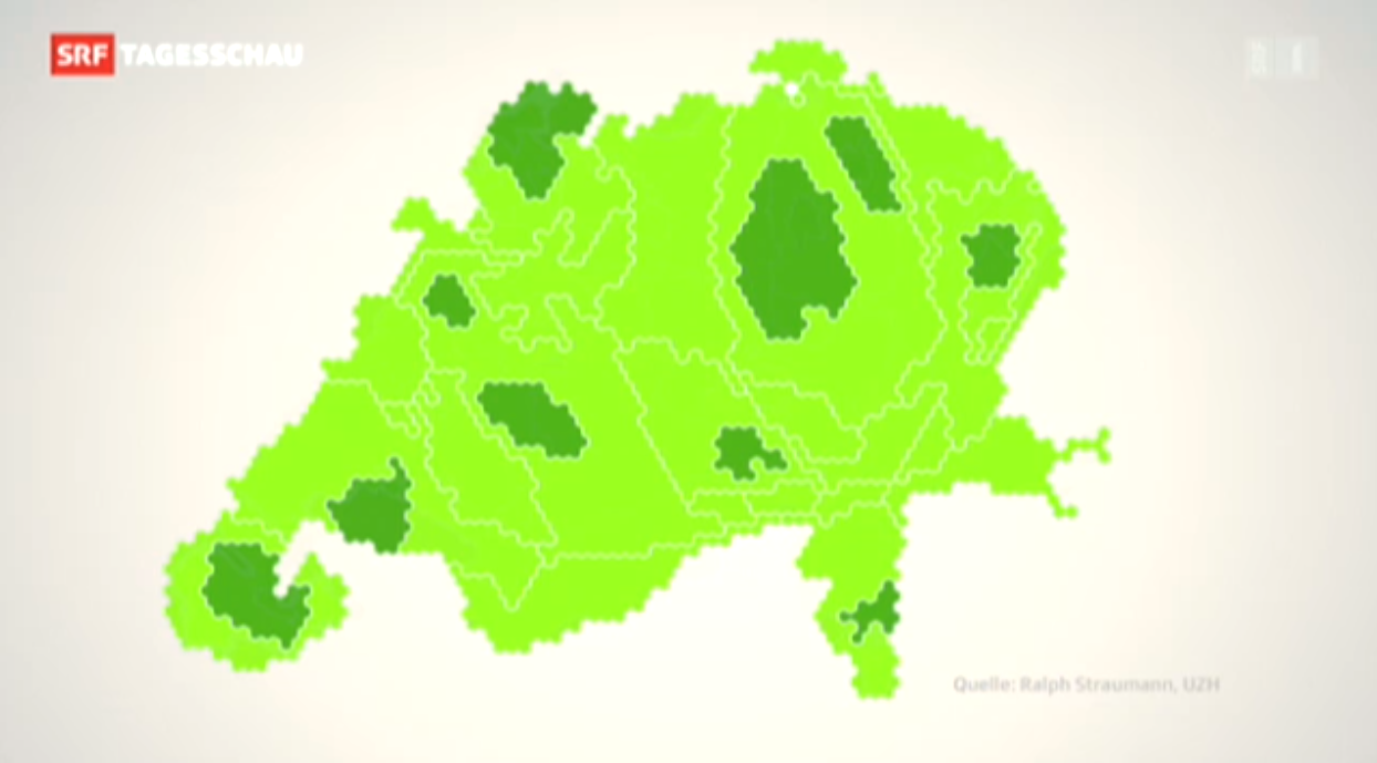
When I published the visualization Switzerland has just held such a poll. The poll did not pass, it achieved only 54.3% of “yes” votes.
– Wait, what? Yep, the vote won a solid majority of the people, but too many cantons said “nay” and thus, by the rules, it was a “nay”. Now, one can argue that this is not sensible or that it is perfectly sensible, I’m not going to do this here. But this background means, to my pleasure, that the visualisation was able to spark and inform many discussions (and met quite an audience). To my big surprise, it was even briefly featured in nation-wide primetime news, in a slightly reworked version.
Conceptually
Linked views
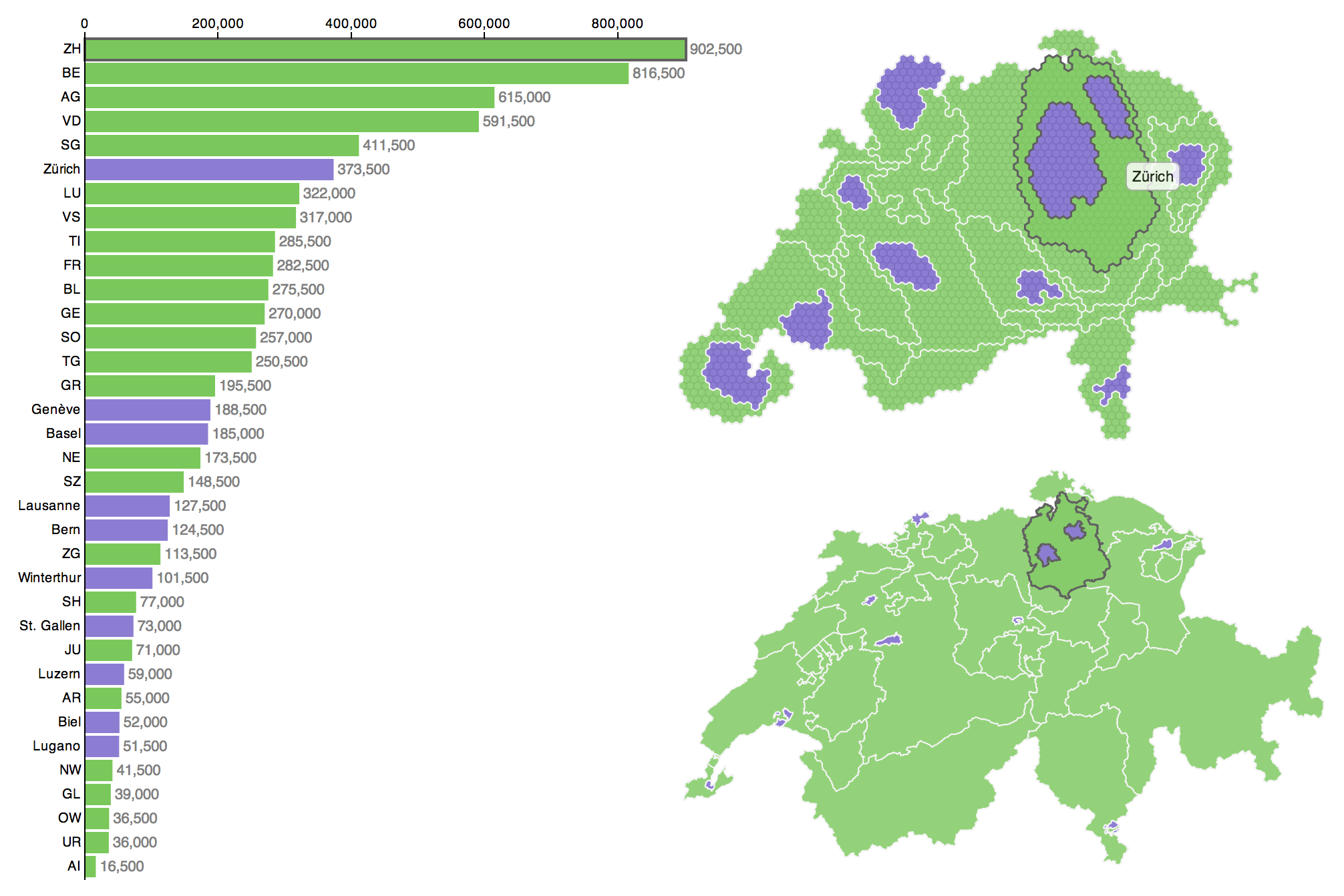
The visualization is a linked view display because it combines three different views onto a dataset: On the left you see a barchart of population numbers in the Swiss cantons (green) and the ten biggest Swiss cities (purple). Bottom right there is an ordinary enough looking map of the same features. Top right there is a cartogram that uses distorted shapes to convey the number of people in each administrative subdivision.
The interaction elements of the three individual views are linked: Irrespective over which one of the three views you hover your mouse pointer, the respective feature is highlighted in the two other – linked – views. I’d suggest this makes the exploration process easier by reducing cognitive load by the amount that would be taken on for cognitively linking features in different views.
Cartograms
The cartogram is probably the most interesting part of the linked view: A cartogram is a map in which a variable is visualized by distorting the features in the map. In this case, the variable is population and the features are cantons and the ten biggest cities (in terms of population). The map beneath the cartogram solely serves as a reference – however, I would argue it is not negligible at all.
Research into the effectiveness of cartograms usually compares them to thematic maps (choropleth maps with or without graduated symbols). Geographers find that the effectiveness of cartograms depends on:
- the variable visualized (qualitative faring better than quantitative),
- on the questions asked or tasks posed,
- on the cartogram type and
- on the complexity of the shapes which are distorted in the cartogram.
I would suggest that many of the drawbacks of cartograms can be solved or at least mitigated by a linked view: the bar graph provides the precise quantitative information (something that is hardly possible with a cartogram and also not easily extracted from a thematic map); the map offers the users a frame of reference, enabling them to make a better judgement of the distortions in the cartogram – even if the users are not familiar with the geography at hand.
Despite potential drawbacks in terms of effectiveness, I think cartograms can be especially attractive visualizations and that they usually draw people’s attention because of their unusual look. This makes them probably quite good vehicles for raising awareness. I think that is why, for example, Worldmapper relies on cartograms for their visualizations (go take a look, but come back).

Of the various kinds of cartograms I had looked into before designing mine, I finally opted for the quite common contiguous cartogram (see above), mainly because I don’t quite like the gaps and broken sense of topology in non-contiguous cartograms and in the classic Dorling cartograms.
Hexagons
The contiguous cartogram I implemented is hexagon-based. This is an idea I got from Leicestershire (UK) when I was researching cartograms. Leicestershire or the UK in general has the concept of Lower Super Output Areas (LSOAs). These conveniently contain roughly 1,500 residents each. So Leicestershire Statistics and Research Online could use them as base-units for their hexagonal cartograms, one of which is shown below.
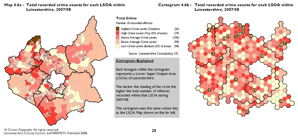
Unfortunately, LSOAs or anything similar do not exist in Switzerland, so I had to come up with a method to produce them (but I will postpone the details to the technical part of this blog post). In any case, i found the hexagonal cartogram design both appealing and inherently sensible. Even more, although I was dealing with cantons and cities (each of which would be made up of many hexagons), I found including the hexagonal structure in the final cartogram useful:
- The hexagons allow a rough estimate of the total population of a region by discretising the space each canton or city takes up in the cartogram.
- Second (and connected to the preceding point), the hexagons in the display improve comparability of regions.
- The hexagonal structure enforces a degree of generalisation, which is a very important step for producing high-quality maps.
- Finally, the hexagons make it immediately clear that the cartogram is an artificial representation.
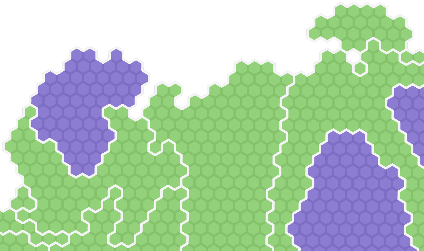
The last point touches an important usability issue, in my opinion: Thanks to the hexagonal structure, there is no confusing the distorted and discretised outlines of the cartogram with actual, unmanipulated outlines – irrespective of potential unfamiliarity with the territory or of taking the cartogram out of context.
The enforced generalisation on the other hand alleviates some of the drawbacks of cartograms, or at least what I perceive as drawbacks: Since the hexagons define a minimum width and area of features, they remove some of the very distorted, “melted” look of the original Gastner–Newman cartogram with partly very thin and elongated features.
I think, with all these features and with labeling it might even have been possible to make the cartogram work well on its own (without the linked views in my visualisation). But – without having any research to prove it (hint, hint, geoviz researchers) – I find the additional, undistorted map and the bar chart provide better context and allow for an improved appreciation of the cartogram.
Colours
The colour scheme is inspired by one of the diverging schemes from Cynthia Brewer’s great Colorbrewer tool (brief reviews by myself of this and other related tools can be found here; there is also a Javascript version of Colorbrewer). The colour scheme I chose should be colourblind-safe and print-friendly.
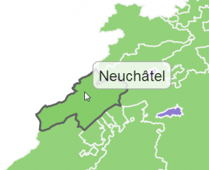
Lastly, on hovering over a map or cartogram object with the mouse pointer, the respective entity is highlighted subtlely using a slightly more saturated green/purple fill, in addition to changing its outline colour.
With this glimpse into my conceptual considerations about producing this particular visualization I conclude my first blogpost on the topic. In a second post, I give the technical specifics of my approach so that you will be able to produce your own cartogram!
More cartogram posts:
Is the source d3.js code available for this anywhere? I’m really interested in understanding how to make linked visualizations!
Hi Chris
Thanks for your interest. You can of course inspect the source code directly on the website using your browser. Note, however, that I have finished this visualization under time pressure in order to upload it on the day of an important poll.
Functionality-wise and technically, my cartogram of Wikipedia in Africa over on the OII Internet Geographies blog (http://geography.oii.ox.ac.uk/?page=information-imbalance-africa-on-wikipedia) is very similar to the population cartogram of Switzerland. If you want to dive into the JavaScript code, I’d recommend that one. I had a bit more time for that and thus the source code is tidier.
Thanks Ralph! That was EXACTLY what I needed, I followed the x_id system you used for linking and it worked out well. Much appreciated :)
Nice to hear, I’m glad it helped you with your project!