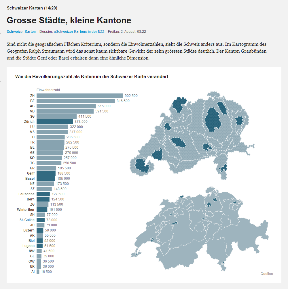
In March, I have published a linked view display with a population cartogram of Switzerland (in German, in French). The occasion was a federal poll that convinced the majority of the voting population but didn’t gain support in enough many cantons. The cartogram has sparked quite some interest and I have covered its conceptualisation as well as its technical realisation in two detailed blog posts. (I still plan to write a third blog post about the realisation in HTML/JS/CSS, feedback as well as sources of inspiration and help.) Through my work at Oxford Internet Institute (OII), I have got in touch with a data journalist of Neue Zürcher Zeitung (NZZ) (specifically, Mark Graham indicated me as a Swiss contact person, when OII was approached by NZZ). As you might know, data journalism/data-driven journalism (#DDJ) is where everybody in print media is turning to in order to attract/inform/entertain an interested audience. Soon enough, NZZ featured my “Zurich Sky” piece online. Then, the population cartogram stirred their interest. Over the last few weeks, NZZ has been producing a series of Swiss maps, some mainstream, some quite whimsical. On 2nd August, they then published a reworked version of my population cartogram (click through for interaction):
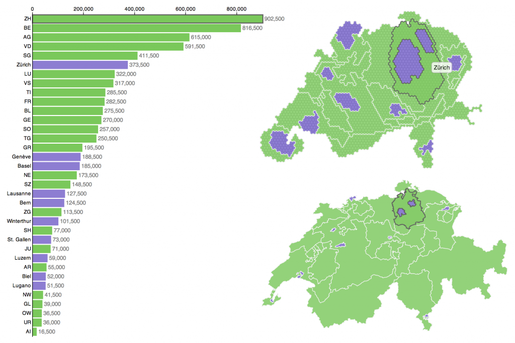
Soon after, the Lausanne-based magazine L’Hébdo asked for permission to feature a reworked version of the population cartogram in print (click to enlarge):

The NZZ version has been adapted by the team of Interactive Things, a Zurich-based “user experience & data visualization studio”. These are the people behind www.datavisualization.ch and as such they are well-known in the global visualization industry and community. The L’Hébdo version has been adapted by the in-house graphics team. For me it is, firstly (and obviously), exciting to see my work more widely published: The more people see this visualization the more people will think about questions of political representation and societal implications. These topics (urban versus rural issues and interests, representation of cities in the Swiss political system) will continue to pop up on the Swiss political agenda over the next decade(s). Secondly and more practically, I’m excited to see and share with you these reworked versions of my visualization, as they have been carried out by top-notch visualization and graphics designers. It is very interesting to see, where my style was tweaked, what elements were dropped, how the interactivity was tuned and so on. For reference, here is a screenshot of my original version:
Hi Ralph, very good work indeed with these hexagon cartograms. Keen to see some tutorials around this soon.
Hi Julian,
thank you very much for your comment!
As a matter of fact you can already check how I have produced these cartograms. I have explained th whole process in two blog posts:
“Conceptualisation of a D3 linked view with hexagonal cartogram”
“Creating a hexagonal cartogram”.
Enjoy!
That’s great! Seen those already. However will try to pay attention more at your process as well.