Some months ago I mapped Switzerland’s administrative regions using a hexagonal cartogram. That idea was inspired by pioneering work of the Leicestershire County Council. After consulting with experts in the field – Leicestershire’s Alex Lea, Danny Dorling of Worldmapper (currently at the University of Oxford) and Adrian Herzog of MAPresso fame – I came up with my own workflow for the creation of such a cartogram, documented here and here. (Though beware: Mike Bostock liked the results but found it relatively laborious when he made one).
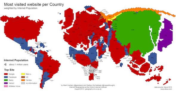
Ever since I published that cartogram, I have the feeling to see hexagonal maps everywhere. Most recently, my friends and colleagues at Oxford Internet Institute, Stefano de Sabbata and Mark Graham, have published the following cartogram along with their now famous map “Ages of Internet Empires”:

Another nice example, though not a cartogram, is this visualization of New York transit times (let’s not talk of the rainbow colour scale for a moment):

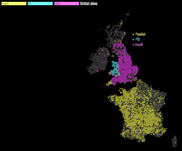
Here, as in the following example of a place name visualisation the hexagons are not used to abstract and generalise cartogram shapes but as tesselations of space:

It seems such hexagonal tesselations have become more fashionable over the last few months. Whenever I see them, I’m reminded of discussions that exceed the mere attractiveness of such a data representation. Obviously, the classical raster data model in GIS consists of a regular grid of quadratic raster cells.

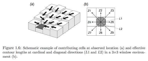
This data model of quadratic cells can cause problems of direction bias or dependence in certain raster analyses that consist of computing new parameters based on a raster cell neighbourhood. In the depiction above you can see how flow direction – an inherently continuous phenomenon! – is commonly discretised on a raster DEM surface into 8 directions in a 3×3 raster window. You can read more on problems of direction bias associated to the grid model we are stuck with in our GIS software in Zhou and Liu (2004).
While the common raster data model will not change (at least not as long as our screens don’t abandon the quadratic shape of pixels), I enjoy seeing hexagons used in inspired ways for other purposes. Be it to please our eyes or, even better, to challenge our conventional and long-standing ways of thinking about, and looking at, field model data, i.e. space-filling, continuously varying data. Hexagon depictions can help to disperse the perception of privileged directions in field model data.
If you, like me, are into unconventional ways of portraying data, you may be interested in this GIS Lounge article on quasi-maps and maybe also about this article that is more specifically about cartograms. Happy reading!
3 thoughts on “Hexagons, quasi-maps and cartograms”
Comments are closed.