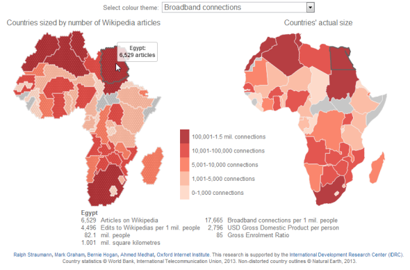
My friends and colleagues at the Oxford Internet Institute, Mark Graham and Stefano de Sabbata, are compiling a collection of maps and visualizations at geography.oii.ox.ac.uk that give insight into the contemporary geographies of knowledge:
- Which places are connected with the online world? Which places are participants in the so-called participatory Web?
- Which places are represented in online gazetteers, in online photo repositories, in social networks?
- What places are reported on in traditional newspapers, in online events databases?
- And, most importantly and in completion to all above questions: Which places aren’t?
I had the opportunity to contribute an interactive visualization to the OII collection. My visualization consists of a cartogram that sizes African countries by the number of geotagged Wikipedia articles within their territories side by side with a ‘normal’ map of Africa. The cartogram serves to highlight, which places are more and less visible in the world’s foremost repository of knowledge – more or less visible than we may gather from a traditional, non-distorted map.
Additionally, the visualization incorporates variables such as population, Internet connections and so on, some of which serve to explain (by means of regression) the amount of Wikipedia content we typically find in a country. Using this model we can also identify countries with atypically large or small amount of Wikipedia content. Check out the full text on the OII website for more insight.
(If you want to view only the visualization (without accompanying text) or embed it in your website like The Guardian (free of charge, of course), use the following URL: http://geography.oii.ox.ac.uk/interactive/africa-on-wikipedia. I also posted a larger version of the visualization on my personal website at: www.ralphstraumann.ch/projects/information-imbalance-africa-on-wikipedia.)

One thought on “The online perspective: Africa on Wikipedia”
Comments are closed.