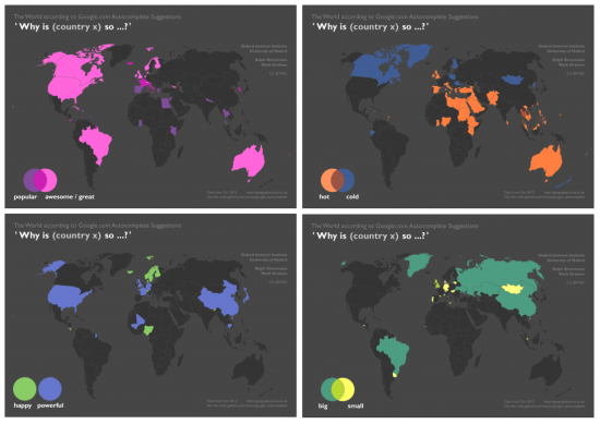
Together with my collaborators in the “Information Geographies” project at the Oxford Internet Institute, I have published a blogpost that analyses Google Autocomplete. This is seemingly a popular pastime these days, but unlike the maps I have seen so far, we don’t just map the most prominent term for each country but actually visualise multiple categories, often in one map.
Why does it matter?
Autocomplete is Google’s ‘type-ahead’ suggestion algorithm: As soon as you enter a word or two into the Google Search field, the algorithm will try to guess the completion of your query and offers you a list of likely queries. This functionality is baked into Google’s interface and cannot be turned off by the user.
It’s unclear if and how much such algorithms affect our perception of the subjects that we are querying for. But we can certainly say that they reduce serendipity and can help reinforcing filter bubbles.
Data acquisition and cartographic technique
The data that went into these maps was acquired using a small Python script and base data from Natural Earth. After a substantial clean-up of the data, it was ready to be mapped (I used Esri ArcGIS for this project).
I pulled a few tricks with intra- and inter-layer transparency. Cartographically, I wanted to achieve a different-than-usual look for these maps. Thus I settled for a dark background, unusual, and unusually vivid, colours and dark continents. The latter are visible, when a country has no data. I liked how the legend turned out: at some point I had the idea of turning the legend into a small Venn diagram, a visualization of its own within the larger visualization. The Venn diagram let’s the viewer judge easily, if the depicted categories overlap or not and, by extension, also make sure that no unnecessary information is contained in the legend.
For two categories, we also compiled reference ‘ground truth’ data:

Visit the Information Geographies blog to view all maps and to read about what we have learnt while compiling them.
I have made the data acquisition script available on Github, so that you can run your own analysis (it would be great to have data in multiple languages!). Our maps are CC-BY, so feel free to re-use them at your will, with attribution.