I will abstain from compiling my own list of “The best …”. Instead, I give you a small list of lists to be consumed at your pleasure:
- The Best Data Visualization Projects of 2014 by FlowingData
All of Nathan’s picks “are interactive or animated or both”. “Telling for where we’re headed.” as he puts it. Among others, this selection contains a very nice looking example of a value-by-alpha map of the U.S. Midterm Elections. Another kind of visualization I personally like is showcased by a piece on Boston’s public transit: The so-called Marey Diagram visualizes space-time abstractly and very effectively.

- Our Favorite Maps of the Year Cover Everything From Bayous to Bullet Trains by Wired
A much appraised pick in this list is certainly the animated UK24 from NATS showing air traffic over the UK. Personally, I like the new geologic map of Mars by the USGS.

- Favourite Maps from 2014 by Kenneth Field
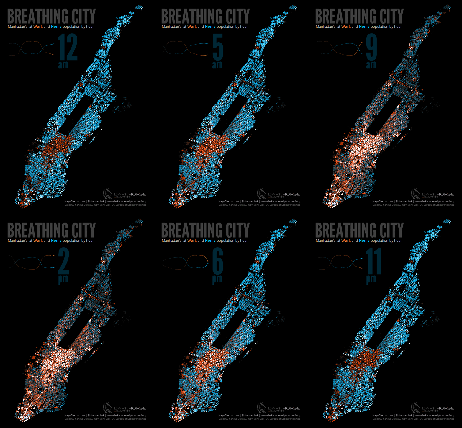
Out of this list my favorites are Ollie O’Brien’s cover for The BMJ and John Cherdarchuk’s dynamic visualization of the population in New York City. O’Brien’s map is an ordinary enough density map of bicycle flow data in London. What makes it stand out is the visual style that likens London’s busy streets to arteries transporting blood through our bodies.

Cherdarchuk’s map is fantastic in the patterns that it shows and I like the very simple visual aid for the overall at home and at work population in the upper left of the visualization.

What were your personal favorites this year?
2 thoughts on “The best in cartography and infoviz of 2014”
Comments are closed.