A few weeks ago, I came across the following graphics on Twitter:


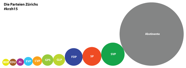
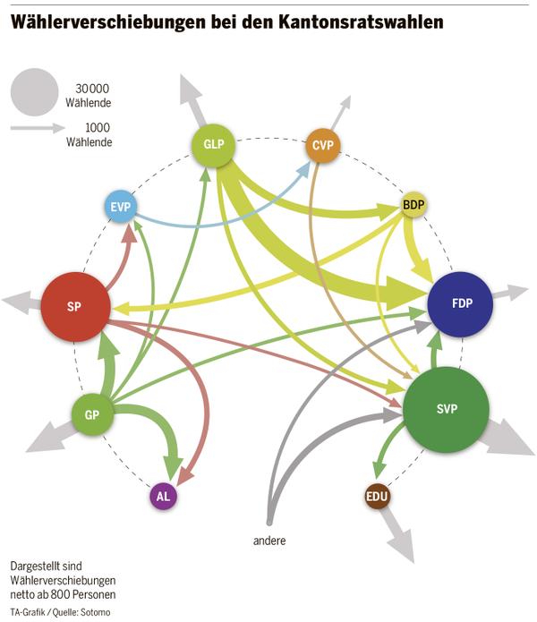
They depict voter share per party (including absentees, in grey) (top) and voter flows between different parties in the 2015 cantonal elections in Zurich. The graphics are produced by sotomo, a research company at the nexus of science and practical application occupying itself with political and economic topics. I’m not sure if only the lower graphic or both have been produced jointly with the Swiss daily Tagesanzeiger, but I think only the lower graphic has been published in the newspaper.
Circles
These graphics pose interesting problems and both are connected to the circles:
The top graphic uses circles to represent voter shares. It’s of course hard to assess the relative sizes of the circles (the usual problem with such depictions). But this is clearly also not the point sotomo aims to make (there are no scales or quantitative labels of any kind). Instead, the point they want to drive home is – I think – that there is a very large share of people who didn’t vote in the elections – and that aspect of the graphic works.
(In parantheses: Even if this might shock you, it’s not very uncommon in Switzerland. Many pundits take it as a sign not of political apathy but rather of people generally being okay with how things are run around here.)
Aside: Scaling and judgement
In the 1950s, various scholars studied biases in perception, one of them being James Flannery. Based on earlier research on how people often judge relative sizes of circles wrongly, he introduced a so-called “appearance compensation” for circular diagrams. This algorithm would adjust relative sizes of circles in a manner that, on average, would compensate for the biased perception. However, nowadays most people argue that these methods should not be used anymore, but instead other means that support accurate perception of circular diagrams.
Flows and circles
Other than the first graphic that I kind of like in its simplicity and to-the-point message, I find the second graphic not ideal. The problem is in the legend and how it instructs us to use the graphic. Both circle size and width of the flow vectors encode the same property: number of voters supporting a party and number of voters who changed their endorsement of a party. Showing these properties is a nice idea, in my opinion. But how the authors chose to depict them damages the message as it is not possible to appreciate both the flows and the party support bases simultaneously and in relation to each other. Even given the legend with the circle representing 30,000 and the arrow representing 1,000 the comparison does not compute.
That’s a shame. I think the reason the authors chose this kind of diagram might have to do with the fact that this and similar diagrams have become very popular over the last few years. Also, they are relatively easily made for example with Gephi or D3.
However, there are clearly better alternatives, in my opinion. For example, the widely used D3 chord diagrams are capable to make the group sizes and the inter-group flows comparable (or, speaking within the above example, the party support and voter flows). An even nicer approach has been used in the UK General Election by The Guardian*. It avoids difficulties that are commonly associated with round graphics by basically unravelling a chord diagram onto a straight axis thereby creating a simple Sankey diagram.
The Guardian’s approach can show group size (party support in 2010, top, and 2015/projected, bottom) as well as the size of flows between the groups (voter flows, from top to bottom) clearly and simultaneously:

The graphic’s complexity is alleviated by the built-in interaction which always highlights only one party (either in 2010 or in 2015) and associated flows. Additionally, the Guardian team have disassembled the wins and losses of the individual parties into distinct static graphics, beneath this comprehensive one (not shown above).
In what clever ways do you visualise group size and flow size, simultaneously or not?
*: In the interest of full disclosure: I have assisted The Guardian with the UK General Election 2015 cartogram.