Today, Swiss daily TagesAnzeiger featured a great piece about climate change and shrinking Swiss glaciers. The article features:
- an animated GIF showing the overall area of glaciers that was lost to melting as compared to the area of the canton of Zurich. This is useful to give the audience a (more) relatable comparison.
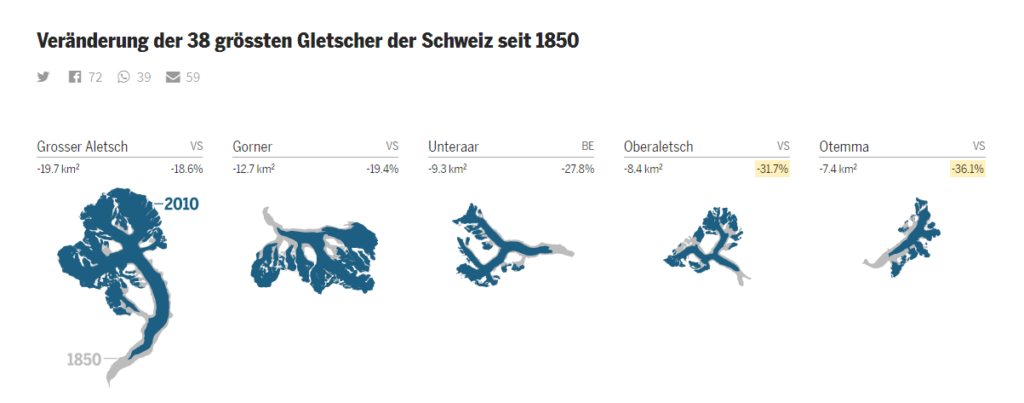
- a small multiples visualisation of the “changes of the 38 biggest glaciers in Switzerland since 1850”, detailling the lost glacier area both in absolute and in relative terms. This is the centerpiece of the article.
- a sample of completely melted glaciers.
- a visual comparison of the melted ice volume to the volume of a prominent skyscraper in the city of Zurich. Again, useful as a more tangible comparison.
- a swipe-able comparison between two photos of a prominent glacier, one in 2010 and one in 2017.
In my opinion, these items represent a good set of visualisations for communicating the topic to the audience. Yet, some things struck me as a bit unfortunate particularly with the small multiples visualisation (and thus I decided to do a quick do-over). Here is TagesAnzeiger’s original:

What I find odd about it:
- The visualisation is meant to be about “changes” (Veränderungen), yet the small maps visually strongly highlight (in dark blue) the glacier area in 2010. The glacier extent in 1850 is shown in light grey and visually completely overwhelmed by the current extent.
- The absolute and relative changes in glacier area are only given as small numbers, the information essentially buried. Even the year labels in the leftmost map are bigger and visually more dominant. The first point means that I cannot grasp at one glance which glacier experienced the biggest or smallest loss in relative area (I might be able to eyeball the absolute area, but even that is challenging given the irregular shapes of the glaciers.
- There are some unclear yellow highlights, which I presume to be about the biggest (above some cutoff value) relative losses. I think, instinctively, the designer felt that it was hard to assess the relative ice losses given only the numbers and the yellow highlights were a crutch to help the reader along.
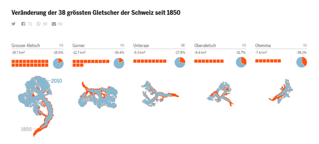
In my quick (-and-dirty) rework of this visualisation, I changed the following:
- visual highlighting of the areas of glacier loss in the maps and lowlighting of the 2010 areas: this gives more prominence to the changes mentioned in the title. A neat secondary effect: the 2010 ice masses resemble actual ice more closely given their now light colour.
- Isotype-esque depiction of the absolute losses in glacier area using small squares of the same colour as the ice loss areas in the maps. This affords immediate visual assessment of the absolute loss.
- Pie-chart depiction of the relative losses in glacier area, again using the same colours as in the small maps. This affords quick comparisons of the relative losses across all glaciers. E.g. I can now see at a glance that relatively speaking, the right-most glacier experienced the biggest loss in ice area.
- removed the yellow highlights
- cosmetics: a bit more whitespace between glacier maps and the rest of the visualisation

That’s it. What do you think?
Guter Artikel! “quick do-over” ist ein bisschen untertrieben :)
Mich hat eigentlich nur der schwer erkennbare Zustand 1850 (grau) gestört. Das aber auf den ersten Blick!
Danke, Markus! Hm, doch war ziemlich schnell; ich würde sagen nicht mehr als 30 Minuten. Den Blogpost zu schreiben, hat länger gedauert :)