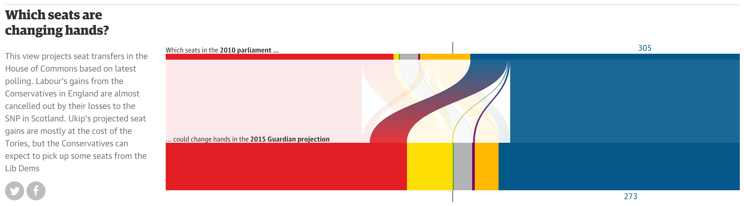
A few weeks ago, I came across the following graphics on Twitter: They depict voter share per party (including absentees, in grey) (top) and voter flows between different parties in the 2015 cantonal elections in Zurich. The graphics are produced by sotomo, a research company at the nexus of science and practical application occupying itself with political and … Continue reading Visualizing group sizes and inter-group flows
I will abstain from compiling my own list of “The best …”. Instead, I give you a small list of lists to be consumed at your pleasure: The Best Data Visualization Projects of 2014 by FlowingData All of Nathan’s picks “are interactive or animated or both”. “Telling for where we’re headed.” as he puts it. Among others, this selection contains … Continue reading The best in cartography and infoviz of 2014
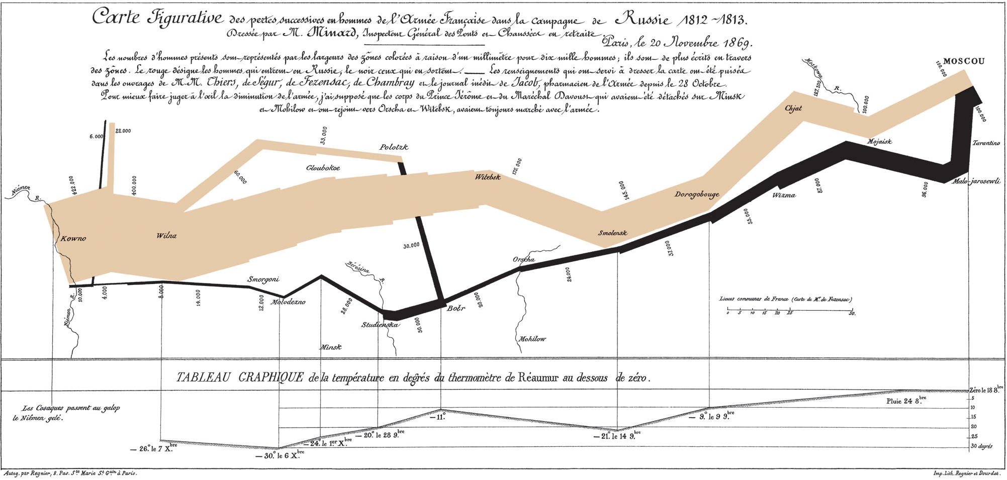
Some days ago, Martin Elmer (@maphugger) tweeted Numberphile’s video in which they highlight the famous Minard map. Martin and I exchanged a series of tweets on the topic: Martin had some substantial criticism of Minard’s graphic. Maybe, graphic is the crucial word here: A part of Martin’s and my discussion was about the (too?) subtle geographic … Continue reading Minard’s march – a hallmark visualization, rightly so?
The Future of GIS according to Esri I’ve been a bit busy recently with, for example, attending the Esri Partner Conference and Developer Summit. If you are interested in the latest news from the GIS world, you can read a review by a colleague and me over on the Ernst Basler + Partners’ geo-blog. Attending the … Continue reading Catch-up
2013 has been a very interesting year for me: I rebuilt my website, started to self-host this blog and successfully applied for it to be included in the Planet Geospatial aggregator. I also revamped the Ernst Basler + Partner GIS blog. From March to May I had an unpaid leave from Ernst Basler + Partner (EBP) and worked in the … Continue reading Happy 2014!
Kenneth Field, Senior Cartographic Product Engineer with Esri and controversial blogger (to some, at least), felt compelled to write a critique of Simon Rogers‘ Beyoncé twitter map (on occasion of an album release) that was hyped by Time Magazine (in a punny way) as being “flawless” (to be very clear: the “flawless” attribute does not originate from the map author and … Continue reading On the Beyoncé tweet map
As announced a while ago, I went to GIS Day in Zurich, Switzerland. On my employer’s blog, I have written up a review of the event in German. Head over to find out about interesting Switzerland-based GIS projects (in-browser-translation should be fine to get the gist, I suppose). Continue reading Review of Swiss GIS Day 2012
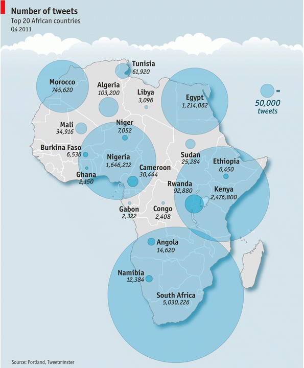
Mark Graham has posted a critique of a “Twitter map” that featured in the Economist at Zerogeography. The map was compiled by Portland Communications and Tweetminster and shows the number of tweets per country (original version of the map can be found in this presentation by Portland Communications): Mark Graham raises these interesting points regarding … Continue reading Economist’s Africa Twitter map provides some teachable insights
Via the GIS Doctor (in itself a fun blog) I got introduced to NY Times’ Opinionator. The Borderlines category on the Opinionator is maintained by author/blogger Franc Jacobs who “writes about cartography, but only the interesting bits.” Borderlines writes about interesting stories around country borders. So far, I’ve read the superbly entertaining and well informed … Continue reading Where’s Europe?
Thenetisabuzz with the news about Google+, Google’s newest attempt to counter Facebook’s dominance in the realm of social networks. Besides India and Brasil, where Google’s Orkut seems popular, the search engine giant has so far failed to successfully enter the social network ground.
"On one hand, you'll never be able to convince your parents to switch. On the other hand, you'll never be able to convince your parents to switch!" (by xkcd)
With the 2010 BP oil spill in the Golf of Mexico and the 2011 Fukushima nuclear power plant accident, environmental disasters have gotten big coverage in the mass media over last months. However, when the biggest shock and public outrage has passed the aftermath of such disasters tends to be less newsworthy to traditional media outlets.
“Big Energy has their communications war room. Counterspill.org is ours.”
This is the claim of Counterspill whose assumed mission is to “promote awareness about the impact of non-renewable energy disasters through a living archive that combines best-in-class reporting, research, social media and community engagement.” Basically, the idea behind Counterspill is to provide on a one-stop portal a counter-narrative to the non-renewable energy industry’s narrative. Counterspill has been launched in April 2011. Its sponsors and partners are primarily philanthropic and environmental organisations as well as NGOs.
The information in the disasters rubric on Counterspill’s website can be accessed directly from the front page. It features an interactive world map and timeline mapping accidents including gas, oil, nuclear and coal in space and time. The timeline can be dragged to select a time window. Using filters one can include only accidents of a certain kind, with a defined size of cleanup costs or involving certain companies. (I assume said cleanup costs also control the size of the circles on the world map, though, this is not explained anywhere)
While being familiar with the context of, and – from a GIS perspective – research into, OpenStreetMap (OSM) and other crowdsourcing efforts in the geospatial field, I was not aware that there are books dedicated to OSM. Over at Po Ve Sham Muki Haklay hosts a comprehensive review (by Thomas Koukoletsos and himself) of two … Continue reading Books on OpenStreetMap


")
