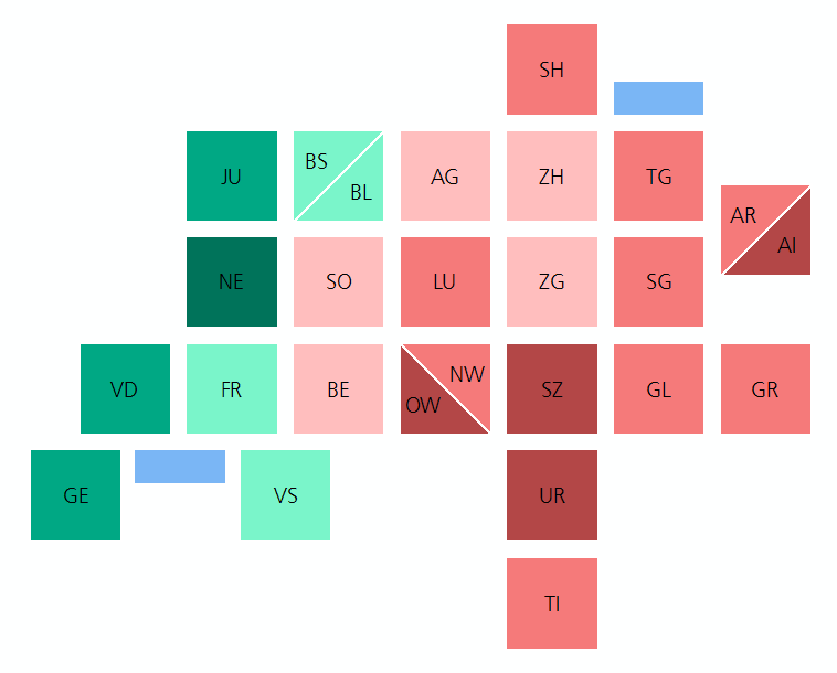
Switzerland tile map
(Blogpost auf Deutsch unter www.geo.ebp.ch) I believe in abstraction for conveying information, or ‘rough’ context for information, efficiently. Since a while, hex and square tile maps are all the rage in the US. Check out this post by the npr visuals team on the technique, with some US examples: An even greater example (imo) comes … Continue reading Switzerland tile map