Today, Swiss daily TagesAnzeiger featured a great piece about climate change and shrinking Swiss glaciers. The article features: an animated GIF showing the overall area of glaciers that was lost to melting as compared to the area of the canton of Zurich. This is useful to give the audience a (more) relatable comparison. a small … Continue reading Reworked: “Gletscherschwund” by TagesAnzeiger
Few days ago, Spencer Chen posted this picture on Twitter: and commented: Nothing is original, esp. in #design. (btw, these are NOT the logos of Medium, AirBNB, Flipboard, and Beats) That’s right. Spencer’s photograph contains the names of the institutions those logos belong(ed) to: a publishing company, a drive-in, an oil company and a city in Germany. … Continue reading Logo look-alikes
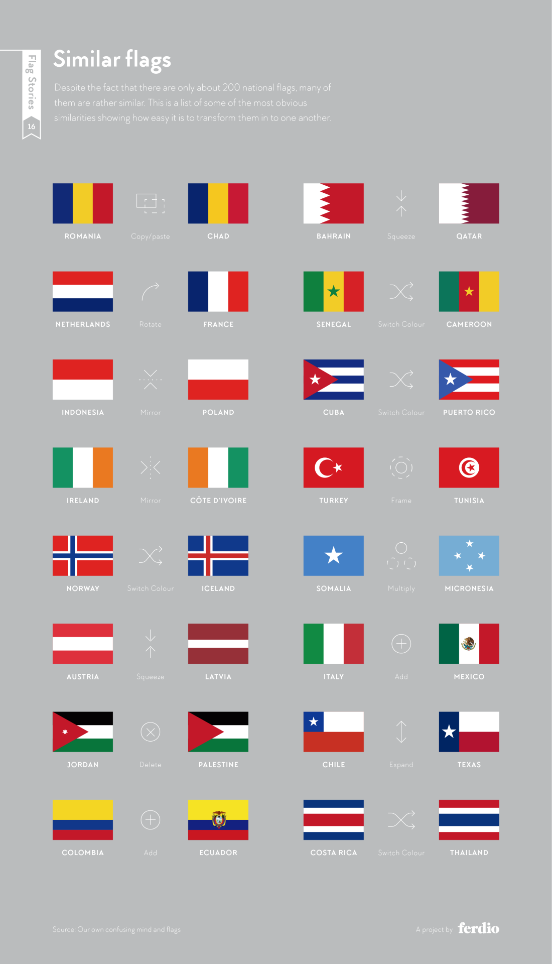
Alas, New Zealand’s proposition for a new flag design has been voted against a few weeks ago: But flags are always an interesting topic of discussion, from a design, cultural, historic, or simply aesthetic point of view. Via my friend Frank Ostermann I’ve learnt about Flag Stories, a website dedicated to the design elements (patterns, … Continue reading Flag geekery
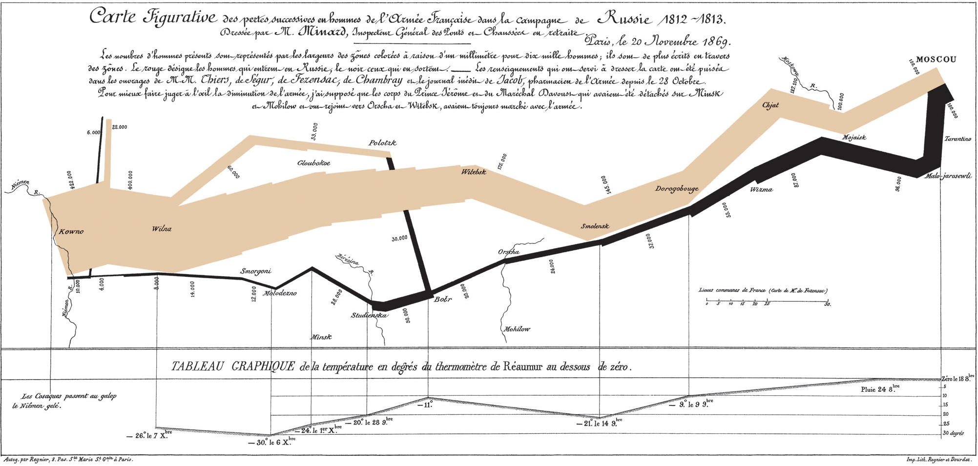
Some days ago, Martin Elmer (@maphugger) tweeted Numberphile’s video in which they highlight the famous Minard map. Martin and I exchanged a series of tweets on the topic: Martin had some substantial criticism of Minard’s graphic. Maybe, graphic is the crucial word here: A part of Martin’s and my discussion was about the (too?) subtle geographic … Continue reading Minard’s march – a hallmark visualization, rightly so?
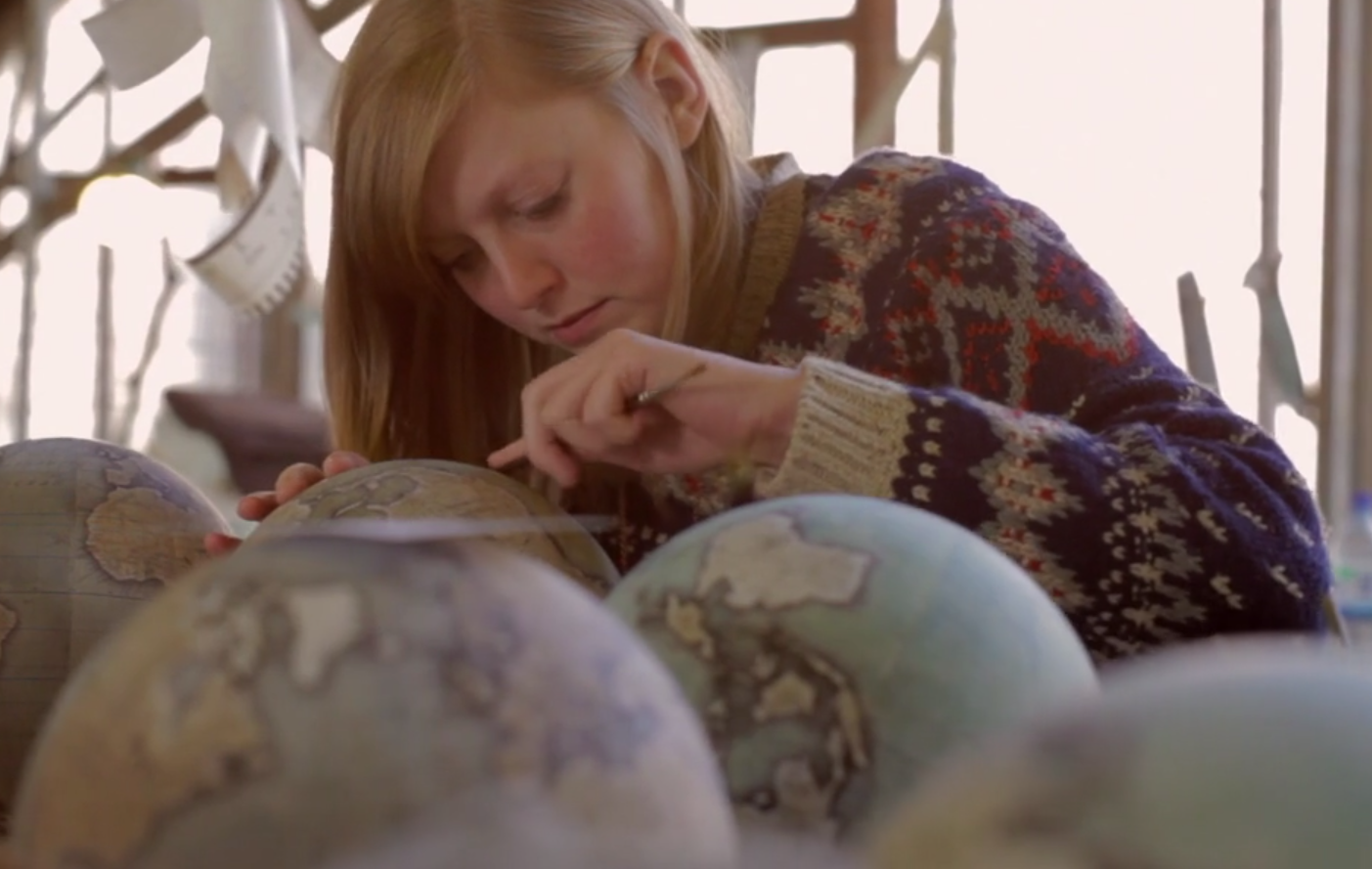
Geohipster or old-school cartography buff, all of you will enjoy The Globemaker, a Cabnine mini-documentary on Peter Bellerby, artisan globemaker and founder of Bellerby and Co. Globemakers. Takes 6 minutes of your time: View Peter and Co.’s products at www.bellerbyandco.com. Continue reading The Globemaker
Kenneth Field, Senior Cartographic Product Engineer with Esri and controversial blogger (to some, at least), felt compelled to write a critique of Simon Rogers‘ Beyoncé twitter map (on occasion of an album release) that was hyped by Time Magazine (in a punny way) as being “flawless” (to be very clear: the “flawless” attribute does not originate from the map author and … Continue reading On the Beyoncé tweet map
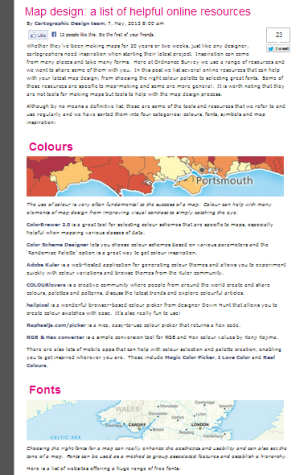
In March, I have published a linked view display with a population cartogram of Switzerland (in German, in French). The occasion was a federal poll that convinced the majority of the voting population but didn’t gain support in enough many cantons. The cartogram has sparked quite some interest and I have covered its conceptualisation as … Continue reading Reworked versions of my hexagonal population cartogram
Neat idea by artist Siyu Cao: a typeface from topographic map excerpts. Hills, ridges and mountains signify letters’ bodies, lakes and low areas the empty spaces around and within letters. The typeface gains clarity when extruded to 3D: Made me wonder how a relief-shaded 2D version or a smoothly interpolated 3D version with imprinted contour … Continue reading Topography in typography
The Ordnance Survey blog posted a nice small compilation of cartographic resources today. They add some more colour resources over the ones I have already reviewed, as well as sites on fonts, symbols and “inspiration” (can’t all of us use some of the latter from time to time? ;-). Definitely not all of the listed … Continue reading OS map design resources
Some weeks ago I visualised the Swiss cantons (states) and their population numbers using what information visualization scientists call a linked view. You can click through to the actual, interactive visualization: here in German or here in French. In what follows I want to give a bit more detail about what led to this visualization and what conceptual thinking went into the design.
In a subsequent post I will also describe the toolset I used to produce this visualization, so that you can build your own. If you’re not interested in the Background, you can skip to the Conceptually section. If that’s neither your cup of tea and you’re here primarily because you want to know how to produce such a visualization yourself, you’ll unfortunately have to patience yourself and wait for the second part of this series (it’s here!).
Background
Why population sizes matter – in such a small country
Why is the particular piece of information that is visualised here important or interesting? Well, in the Swiss political system cantons are represented at the federal level, whereas cities aren’t. However, some of the big cities represent a considerably larger number of people than quite some of the smaller cantons. There have been many debates if and how cities ought to be represented in the political system, about the specificity of urban issues and how those are dealt with or ignored in Swiss politics and if weighting of the cantons should be adapted to better match their population size. The issue crops up both in relation to elections and polls (Switzerland having a direct democracy there are really many of the latter).
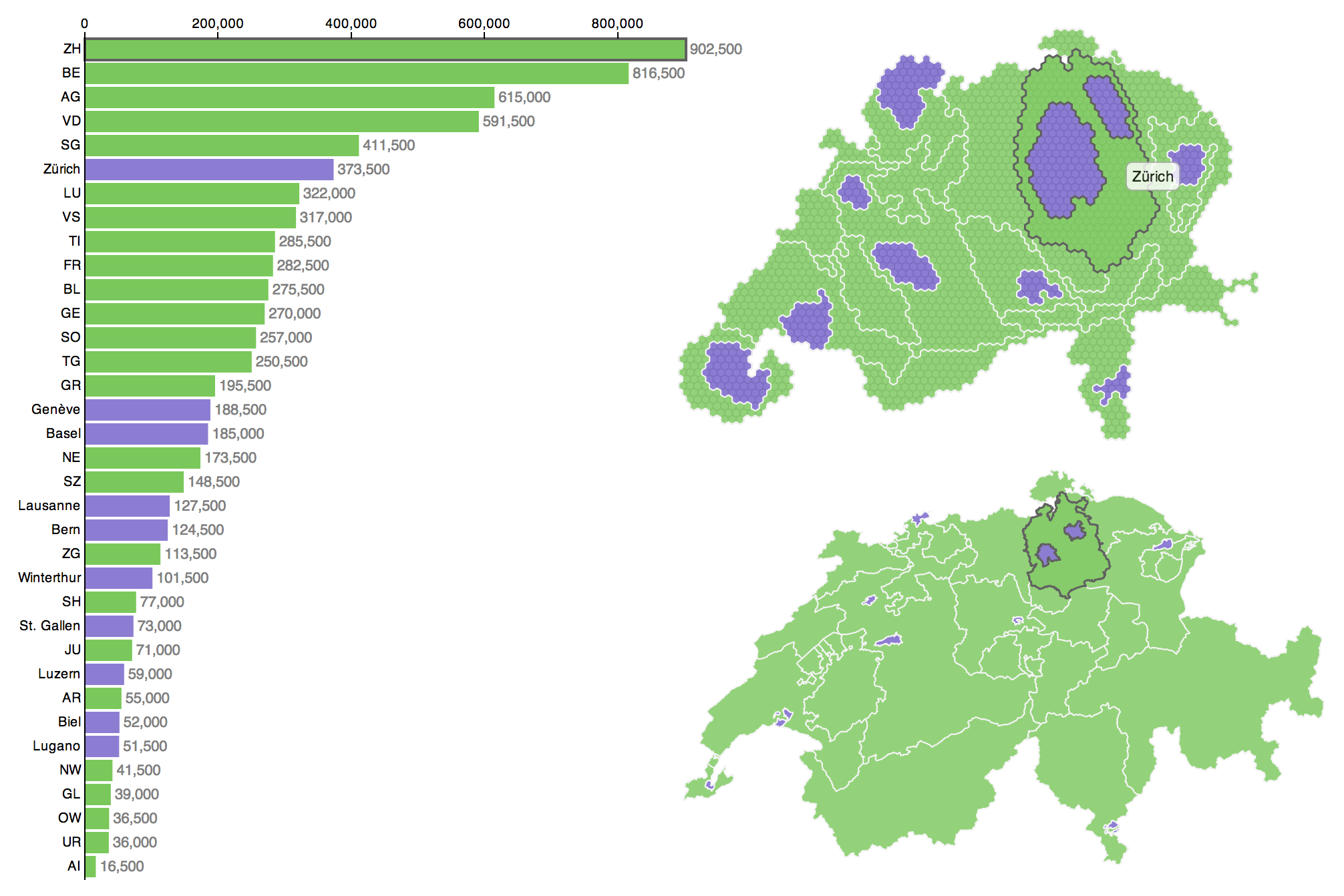
Cartogram on Swiss TV
When I published the visualization Switzerland has just held such a poll. The poll did not pass, it achieved only 54.3% of “yes” votes.
– Wait, what? Yep, the vote won a solid majority of the people, but too many cantons said “nay” and thus, by the rules, it was a “nay”. Now, one can argue that this is not sensible or that it is perfectly sensible, I’m not going to do this here. But this background means, to my pleasure, that the visualisation was able to spark and inform many discussions (and met quite an audience). To my big surprise, it was even briefly featured in nation-wide primetime news, in a slightly reworked version. Continue reading “Conceptualisation of a D3 linked view with a hexagonal cartogram”
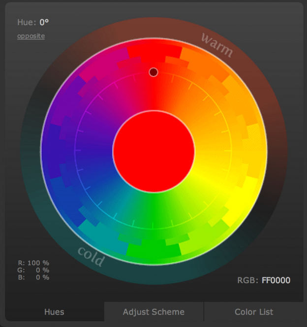
Picking up where I have left, I have a nice addition to my collection of colour tools for visualisation experts: http://color.hailpixel.com What you see below is the whole interface, when you open the website by Devin Hunt. Choosing colours is easy as pie: Move your mouse pointer around and the area changes its colour. Once you … Continue reading Hailpixel’s colour tool
When designing a map or a visualisation, sooner or later there is the point where you have to choose a range of colours (except in very specific circumstances which may require you to produce a black-and-white or greyscale visualisation). What is there to consider in such a situation?
Appropriate use of colours
According to Bertin‘s (1918–2010) seminal work, Semiologie Graphique, colour (defined as hue with constant value) as a visual variable is both selective and associative. These mean, respectively, that an object with slightly differing hue can be selected with ease out of a group of objects and that objects with identical colour but differing values for other visual variables (e.g., in the case of shape as the other variable: a red circle, a red square and a red triangle) can easily be grouped mentally. Continue reading “Colour me well-informed”