Colour me well-informed

When designing a map or a visualisation, sooner or later there is the point where you have to choose a range of colours (except in very specific circumstances which may require you to produce a black-and-white or greyscale visualisation). What is there to consider in such a situation?

ColorSchemeDesigner

Appropriate use of colours

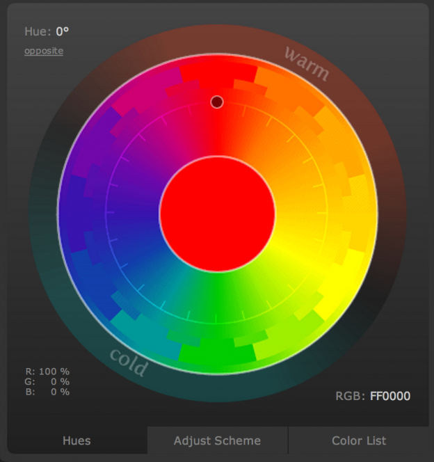
According to Bertin‘s (1918–2010) seminal work, Semiologie Graphique, colour (defined as hue with constant value) as a visual variable is both selective and associative. These mean, respectively, that an object with slightly differing hue can be selected with ease out of a group of objects and that objects with identical colour but differing values for other visual variables (e.g., in the case of shape as the other variable: a red circle, a red square and a red triangle) can easily be grouped mentally. Continue reading “Colour me well-informed”

Potential for improvement: Font legibility in cars

Researchers from MIT AgeLab and a typeface design company have investigated, how font readability of digital menus on a 7 inch display affects glance times of drivers, that is the time the drivers had their eyes on the display rather than on the (simulated!) road. Glance times were measured using an eye-tracking system. The experiment … Continue reading Potential for improvement: Font legibility in cars

Skobbler’s OSM map

Skobbler produces apps and maps based on OpenStreetMap (OSM) data. Under http://maps.skobbler.com they’ve released an OSM-based map. I’ve always had mixed feelings about how OSM presented their map online. While I like the project very much and on and off use OSM data in my projects, I don’t like many things about the visual style both of … Continue reading Skobbler’s OSM map

Google+ manifests new approach to Google interface design

The net is abuzz with the news about Google+, Google’s newest attempt to counter Facebook’s dominance in the realm of social networks. Besides India and Brasil, where Google’s Orkut seems popular, the search engine giant has so far failed to successfully enter the social network ground.

"On one hand, you'll never be able to convince your parents to switch. On the other hand, you'll never be able to convince your parents to switch!" (by xkcd)

Currently, Google+ is invite-only, so no hands-on testing. But what can be said already from one of the teaser videos is that the visual design of the newest Google product deviates somewhat from what we are acquainted with out of the Googleplex. Engadget has collected numerous trailers highlighting Google+ features, the one in question is The Google+ project: A quick look, embedded below: Continue reading “Google+ manifests new approach to Google interface design”