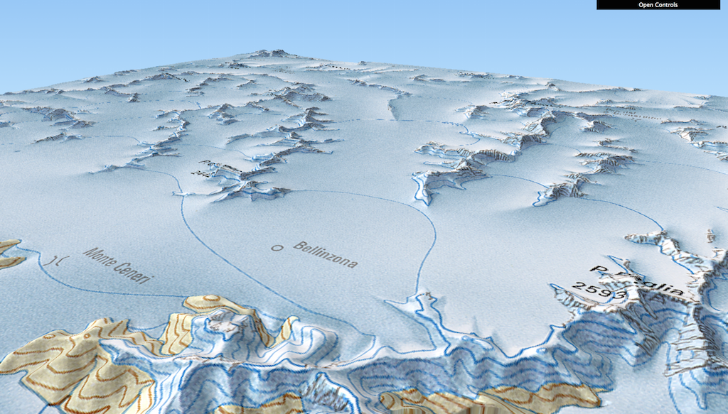
Switzerland tile map

(Blogpost auf Deutsch unter www.geo.ebp.ch) I believe in abstraction for conveying information, or ‘rough’ context for information, efficiently. Since a while, hex and square tile maps are all the rage in the US. Check out this post by the npr visuals team on the technique, with some US examples: An even greater example (imo) comes … Continue reading Switzerland tile map

Visualizing group sizes and inter-group flows

A few weeks ago, I came across the following graphics on Twitter: They depict voter share per party (including absentees, in grey) (top) and voter flows between different parties in the 2015 cantonal elections in Zurich. The graphics are produced by sotomo, a research company at the nexus of science and practical application occupying itself with political and … Continue reading Visualizing group sizes and inter-group flows

The best in cartography and infoviz of 2014

I will abstain from compiling my own list of “The best …”. Instead, I give you a small list of lists to be consumed at your pleasure: The Best Data Visualization Projects of 2014 by FlowingData All of Nathan’s picks “are interactive or animated or both”. “Telling for where we’re headed.” as he puts it. Among others, this selection contains … Continue reading The best in cartography and infoviz of 2014

To all you Geohipsters out there

Have you heard of the Geohipster blog? It’s the self-described place for people who ‘grow their own organic vertices, use gluten-free topology or only geocode by hand, in small batches’. And I give at a big recommendation, put it into your feed reader. And relax, you don’t need to be a fixie aficionado/-a in order to appreciate the Geohipster movement. Atanas … Continue reading To all you Geohipsters out there

Geocoding Twitter users – The #SwissGIS map

Recently, I’ve been experimenting with some Twitter-oriented hacks together with my friend Tom. A very preliminary result of these activities is what I call the #SwissGIS map. Some, just a little, history: Over the last few years, I have been collecting Switzerland-based Twitter users that talk about topics around GIS, cartography, webmapping and geomatics on a list called SwissGIS. Find … Continue reading Geocoding Twitter users – The #SwissGIS map

When NOT to use maps

Recently, I’ve stumbled across Noah Iliinsky’s Where 2012 talk When To *Not* Use Maps. The title immediately intrigued me. As a geographer and data consultant I’m convinced, an important part of my work lies in the question what tools best fit a purpose or a goal I want to achieve. But this is only one side of … Continue reading When NOT to use maps

Minard’s march – a hallmark visualization, rightly so?

Some days ago, Martin Elmer (@maphugger) tweeted Numberphile’s video in which they highlight the famous Minard map. Martin and I exchanged a series of tweets on the topic: Martin had some substantial criticism of Minard’s graphic. Maybe, graphic is the crucial word here: A part of Martin’s and my discussion was about the (too?) subtle geographic … Continue reading Minard’s march – a hallmark visualization, rightly so?