Projects and Tools
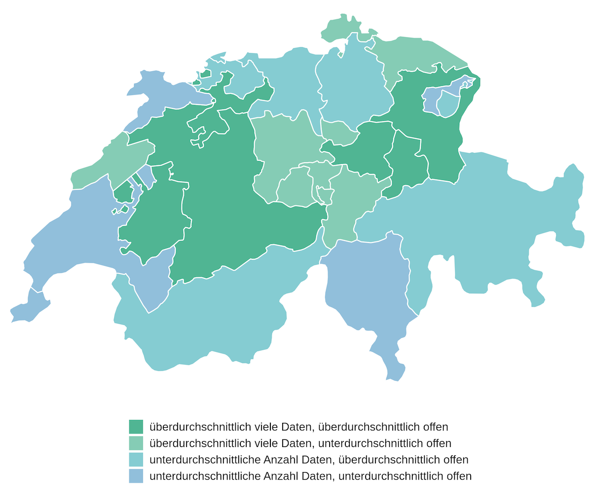
Verfügbarkeit von Geodaten auf geodienste.ch
On geodienste.ch, the Swiss cantons and the Principality of Liechtenstein make their geodata available to the public. This automatically updated and interactive website compares the cantons’ offerings in terms of the number of available datasets and in terms of how openly the cantons make their data available (e.g. what are the terms and conditions for using the data?, is a contract required to use the data?, etc.).
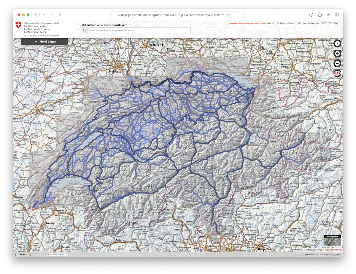
Veloland Cycling Maps
Under the brand «Veloland», schweizmobil.ch offers information about Switzerland’s cycling network. The usability of this data is not ideal for my use case. To make planning cycling trips in easier I obtained the data behind «Veloland» and converted it into distincly styled KML files which can be viewed in the map viewer of the Swiss Confederation (and thus be viewed in combination with all the other map layers available there).
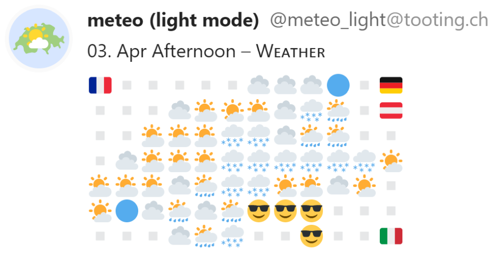
Emoji Weather Bot
This project encompassed the design and programming of software bots for automatically publishing weather forecasts. The forecasts are broadcast three times a day using emojis arranged in a tilemap representation of Switzerland. The group of bots encompasses the standard weather forecast, a temperature forecast, a wind speed forecast and a wind direction forecast. It runs GitHub infrastructure and broadcasts on the Mastodon social network in the so-called Fediverse.
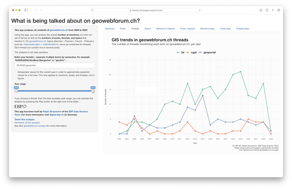
Geotrends App
Using the Geotrends App, you can analyse the popularity of terms used in an online geoinformation forum (geowebforum.ch). The app visualizes the number of mentions of a term (or set of terms) over time. It is programmed in R and Shiny. The underlying data is scraped monthly using Python. The data is stored in, and queried from, an SQLite database. The scraper and the app are explained in more detail in two blog posts: Scraping data from a GIS web forum using Python and Web-App: Trends in der Geoinformation.
Elevation Tilemaps
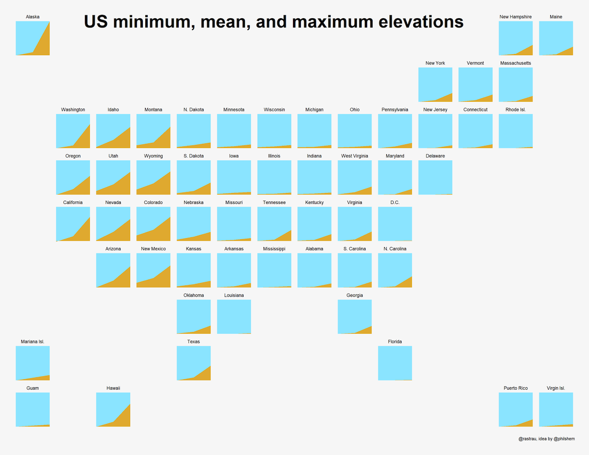
This is a small demonstration of tilemaps and how to create them using R, the geofacet package and the Geo Grid Designer. The examples shown are tilemaps containing slopegraphs of the minimum (in some cases: mean) and maximum elevations of each state or country, in the US, in Europe, and in Switzerland. They are not meant to convey deeper meaning, but they do show how tilemaps can abstract geography and visualize big patterns in data.
Population of Cities and Cantons
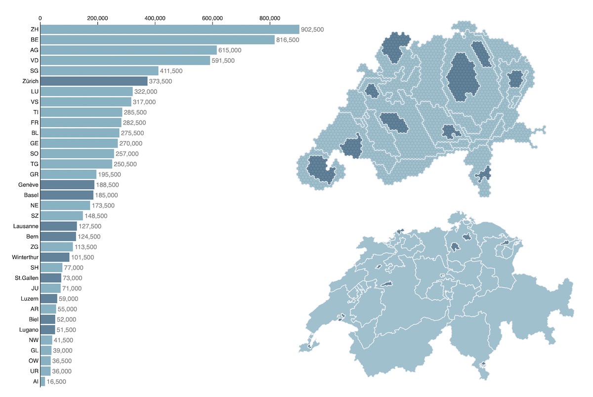
What should be the respective weights of cantons and of cities in Swiss politics? In the context of federalism versus subsidiarity and of frequent votes and referenda this question comes up often. I created this visualization of respective sizes of cantons and the biggest cities of Switzerland in terms of both area and population in D3. More information can be found in my blog. This visualization has also been featured in an award-winning article series in the Swiss daily NZZ.
Urban Mobility Viewer
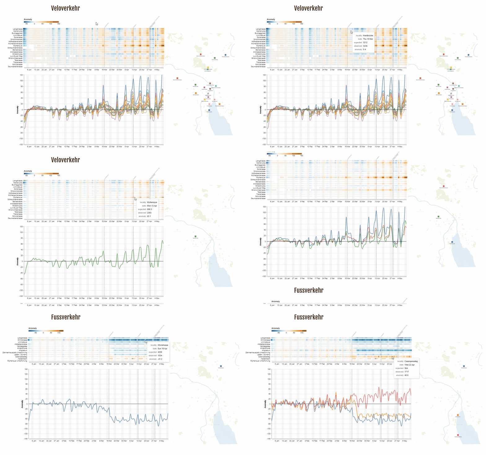
The Urban Mobility Viewer seeks to answer how we are moving around our cities while facing a global pandemic and how lockdowns or shutdowns have affected movement. Using sensors from open data sources, we visualize movement of people. The visualizations encompass dynamic heatmaps displaying traffic counts for individual days. The heatmap is linked to a map displaying the traffic counter locations and to a line graph showing anomalies (Chi values) in traffic volume over time.
The Data Worker’s Manifesto
Both my research and my work have showed me times and times again that working with data requires ethos. We need to take into account biases, assumptions, or downright errors in our data and data collection procedures. Making sense of data and critically appreciating analyses that are carried out will become a skill of growing importance. Ideally, as data workers we are able to educate wider society about limitations of data gathering, data itself, and data analysis. To this end I presented my Data Worker’s Manifesto at GeoBeer #8 in Zurich.
The World as Seen by a Search Algorithm
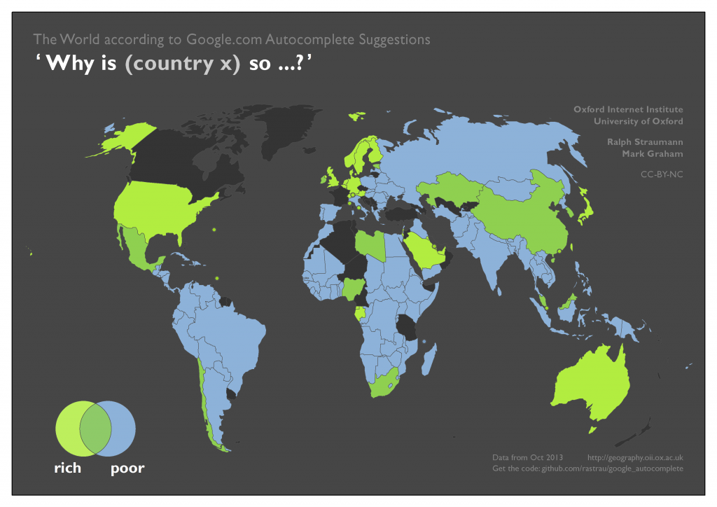
This project visualises the terms Google Autocomplete – Google’s “type-ahead” suggestion algorithm – associates with different countries. This functionality is baked into Google’s interface and cannot be turned off by the user. It’s unclear if and how much such algorithms affect our perception of the subjects that we are querying for. But we can certainly say that they can help reinforcing filter bubbles. The results of the analysis show how Google can actively shape the knowledge we obtain about different parts of the world. This analysis was part of my work in the “Information Geographies” project at the Oxford Internet Institute (2013–2018). There is also an accompanying blog post.
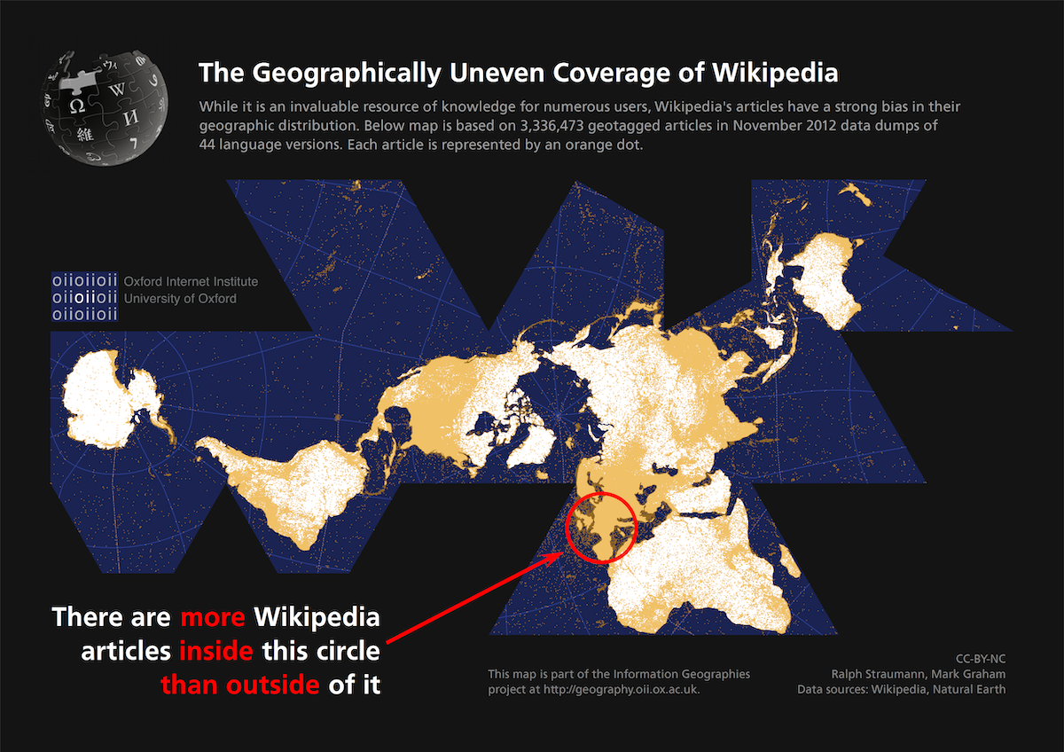
The Geographically Uneven Coverage of Wikipedia
Geocoded articles in 44 different language versions of Wikipedia show a very uneven geographic distribution that does not portray settled area or population very well: Western-Central Europe features 50% of all Wikipedia articles analyzed, despite accounting only for 2.5% of the world’s land area. The whole African continent contains about 2.6% of all articles while representing 20% of the world’s land area and 14% of the world’s population. This project was part of my work at the Oxford Internet Institute (2013–2018).
