Hexagons, quasi-maps and cartograms
Some months ago I mapped Switzerland’s administrative regions using a hexagonal cartogram. That idea was inspired by pioneering work of the Leicestershire County Council. After consulting with experts in the field – Leicestershire’s Alex Lea, Danny Dorling of Worldmapper (currently at the University of Oxford) and Adrian Herzog of MAPresso fame – I came up with my own workflow for the creation of such a cartogram, documented here and here. (Though beware: Mike Bostock liked the results but found it relatively laborious when he made one).
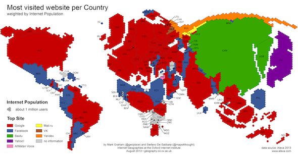
Ever since I published that cartogram, I have the feeling to see hexagonal maps everywhere. Most recently, my friends and colleagues at Oxford Internet Institute, Stefano de Sabbata and Mark Graham, have published the following cartogram along with their now famous map “Ages of Internet Empires”:
Another nice example, though not a cartogram, is this visualization of New York transit times (let’s not talk of the rainbow colour scale for a moment): Continue reading “Hexagons, quasi-maps and cartograms”