Lego maps

John Nelson‘s blog post on Lego-ified maps inspired me to play around with some satellite imagery myself. John’s description of the process is very clear and easy to follow. The only thing I’d add is a recommendation to use a graphics software that has a function to “Pixelate” or “Downsample” images. I used Paint.net on … Continue reading Lego maps

Switzerland tile map

(Blogpost auf Deutsch unter www.geo.ebp.ch) I believe in abstraction for conveying information, or ‘rough’ context for information, efficiently. Since a while, hex and square tile maps are all the rage in the US. Check out this post by the npr visuals team on the technique, with some US examples: An even greater example (imo) comes … Continue reading Switzerland tile map

To all you Geohipsters out there

Have you heard of the Geohipster blog? It’s the self-described place for people who ‘grow their own organic vertices, use gluten-free topology or only geocode by hand, in small batches’. And I give at a big recommendation, put it into your feed reader. And relax, you don’t need to be a fixie aficionado/-a in order to appreciate the Geohipster movement. Atanas … Continue reading To all you Geohipsters out there

Geocoding Twitter users – The #SwissGIS map

Recently, I’ve been experimenting with some Twitter-oriented hacks together with my friend Tom. A very preliminary result of these activities is what I call the #SwissGIS map. Some, just a little, history: Over the last few years, I have been collecting Switzerland-based Twitter users that talk about topics around GIS, cartography, webmapping and geomatics on a list called SwissGIS. Find … Continue reading Geocoding Twitter users – The #SwissGIS map

What Google Autocomplete tells us about countries

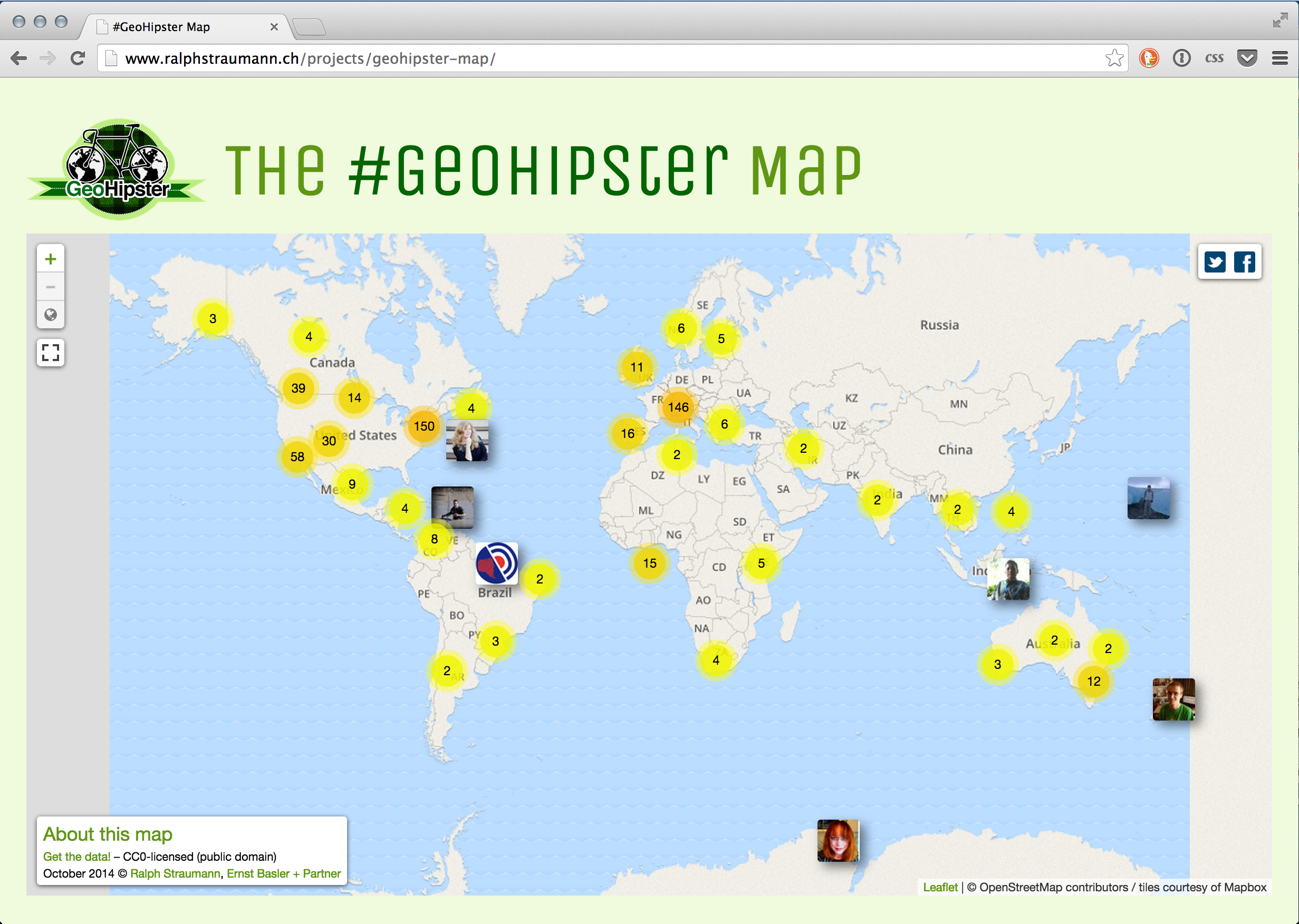
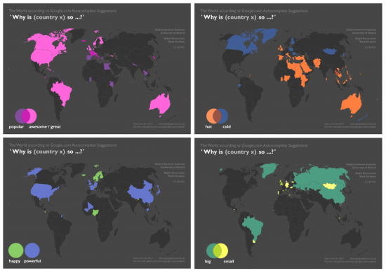
Together with my collaborators in the “Information Geographies” project at the Oxford Internet Institute, I have published a blogpost that analyses Google Autocomplete. This is seemingly a popular pastime these days, but unlike the maps I have seen so far, we don’t just map the most prominent term for each country but actually visualise multiple categories, often in one map.

Why does it matter?

Autocomplete is Google’s ‘type-ahead’ suggestion algorithm: As soon as you enter a word or two into the Google Search field, the algorithm will try to guess the completion of your query and offers you a list of likely queries. This functionality is baked into Google’s interface and cannot be turned off by the user.

It’s unclear if and how much such algorithms affect our perception of the subjects that we are querying for. But we can certainly say that they reduce serendipity and can help reinforcing filter bubbles.


Google-Autocomplete-countries-Oxford-Internet-Institute-Ralph-Straumann


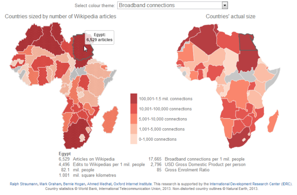
Data acquisition and cartographic technique

The data that went into these maps Continue reading “What Google Autocomplete tells us about countries”

The online perspective: Africa on Wikipedia

My friends and colleagues at the Oxford Internet Institute, Mark Graham and Stefano de Sabbata, are compiling a collection of maps and visualizations at geography.oii.ox.ac.uk that give insight into the contemporary geographies of knowledge:

  • Which places are connected with the online world? Which places are participants in the so-called participatory Web?
  • Which places are represented in online gazetteers, in online photo repositories, in social networks?
  • What places are reported on in traditional newspapers, in online events databases?
  • And, most importantly and in completion to all above questions: Which places aren’t?

Continue reading “The online perspective: Africa on Wikipedia”

Hexagons, quasi-maps and cartograms

Some months ago I mapped Switzerland’s administrative regions using a hexagonal cartogram. That idea was inspired by pioneering work of the Leicestershire County Council. After consulting with experts in the field – Leicestershire’s Alex Lea, Danny Dorling of Worldmapper (currently at the University of Oxford) and Adrian Herzog of MAPresso fame –  I came up with my own workflow for the creation of such a cartogram, documented here and here. (Though beware: Mike Bostock liked the results but found it relatively laborious when he made one).

Ever since I published that cartogram, I have the feeling to see hexagonal maps everywhere. Most recently, my friends and colleagues at Oxford Internet Institute, Stefano de Sabbata and Mark Graham, have published the following cartogram along with their now famous map “Ages of Internet Empires”:

Internet Empires by OII

Another nice example, though not a cartogram, is this visualization of New York transit times (let’s not talk of the rainbow colour scale for a moment): Continue reading “Hexagons, quasi-maps and cartograms”